Thoughts on Apple's Upcoming Mixed Reality Headset

Drawings made with Midjourney version 4.

Sometime this year, Apple is expected to unveil a major new product category in the form of a virtual and augmented reality headset. I’ve been thinking about what Apple may introduce based on existing products in the market, human sight limitations, and Apple’s existing processor options. My guess is that Apple’s philosophy will be to surpass existing mainstream VR headsets when it comes to visual fidelity while also not getting terribly close to life like visualizations. This assumption is based on my understanding of GPU processing and cost limitations. I also think the major question at this point is still whether or not Apple wants to create a headset that’s intended to be standalone or if they want the headset to be used in conjunction with an external computer.

Educated guesses on display specs

Human eyesight has limitations that correspond fairly well with display specs. Humans can only see so much at once (field of view), can only interpret so much light before they just see white (brightness), can only track motion with so much clarity (refresh rate), can only see so much detail (resolution), etc.

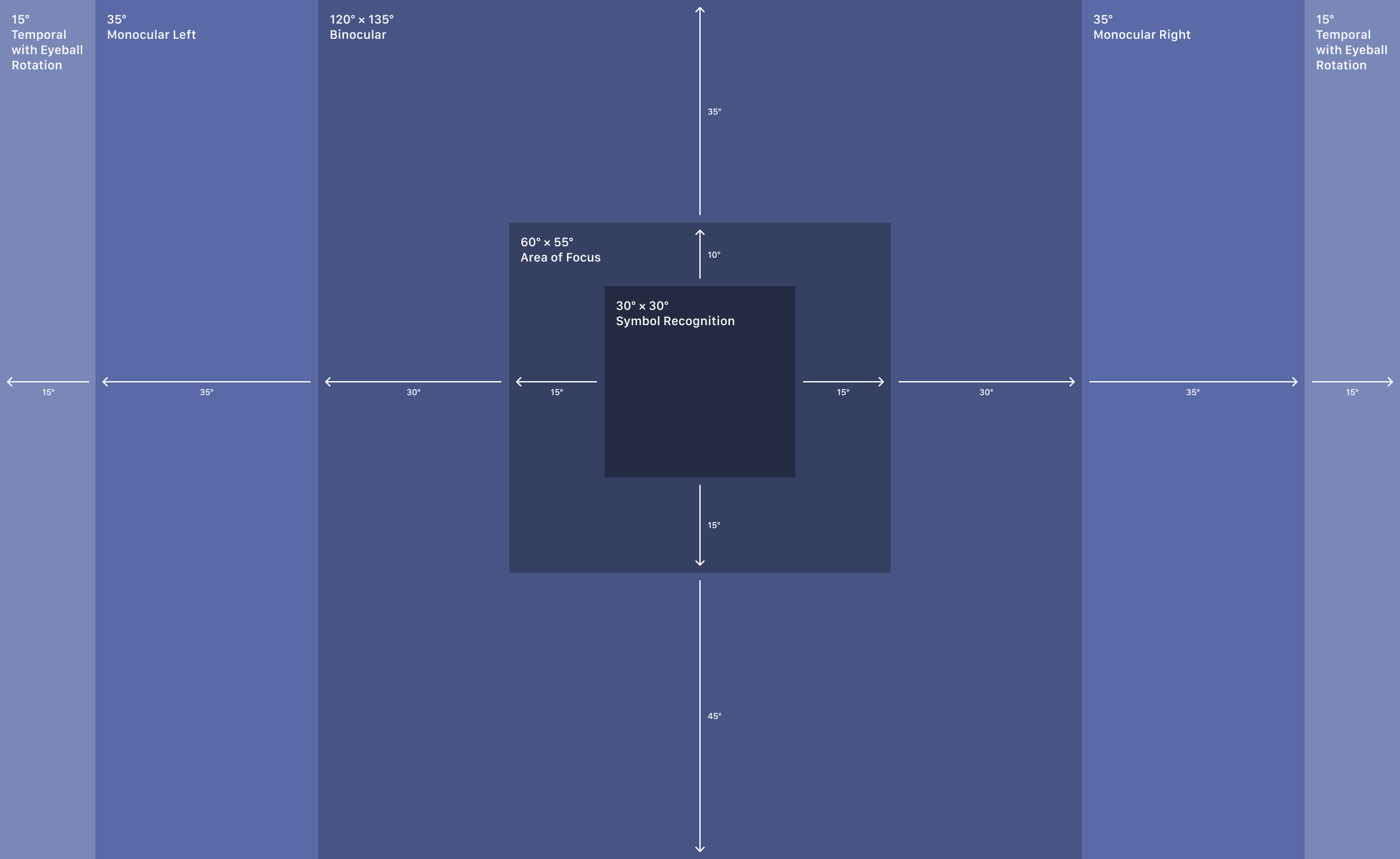
Resolution and field of view are a good place to start. The human eye is capable of seeing a field of view of about 220° horizontally and 135° vertically. I made this diagram to help illustrate how field of view is broken down by region. As you can tell by reading this sentence, it’s difficult to read other text in your field of view while looking at this word, so the center area is the most important while the outside areas provide a sense of place and context.

This diagram is based on several similar sources.

Most headsets have displays within the binocular range, having a field of view of around 100° vertically and horizontally. The two displays in the VR headset have significant content overlap between them so that the user perceives them as one stereoscopic view. Here you can see a few examples. The dark orange region in the center represents content overlap between the two displays.

My guess is that Apple will be interested in breaking out of the binocular range and start to show content in the monocular areas to the left and right. Adding this extra field of view is especially helpful for augmented reality, where the user wants to see their own physical space. This is something that’s done by StarVR so it isn’t unprecedented. Though it is worth noting that the StarVR headset has a relatively low-resolution display. Apple will have to tread into the monocular zone cautiously though since this will increase resolution and therefore performance requirements. My guess would be that Apple chooses two 1.18:1 displays spanning 130° horizontally and 110° vertically. This would place them squarely above mainstream headsets in the market today without putting extreme performance requirements on their device.

Apple’s headset could stretch into the monocular regions while staying constrained enough to be able to support a high PPD count.

The next area for Apple to consider is resolution. The human eye is thought to be able to stop perceiving additional detail after 60 pixels per degree. So in the same way that Steve Jobs presented 326 pixels per inch as retina resolution on a phone display, the Apple headset would need 60 pixels per degree to be considered retina resolution within a headset. This would be quite hard for Apple to achieve. Not just from a resolution density perspective but also from a computing performance perspective. Based on the FOV above, 60 PPD would entail having two 7,800 by 6,600 pixel displays. And these displays would need to be outputting decent graphics at a fast refresh rate.

Fortunately for Apple, no one is close to 60 PPD in the mainstream VR headset market. The Meta Quest 2 has a PPD of about 19. The HP Reverb G2, widely considered to be very high resolution, has just 24 PPD. My guess would be that Apple’s headset will have 30 PPD, allowing them to rightfully claim industry leading resolution, while also giving themselves future generations to work towards 60 PPD. There are some resolution tricks that Apple could try like having the center area of the display have a higher PPD than the rest of the display, but this would probably not result in a seamless enough experience. So the resolution for each eye would be 3,900 by 3,300 pixels. That’s about 5 million more pixels than the Pro Display XDR.

PPD Comparison

In terms of peak brightness, humans stop perceiving additional brightness after about 10,000 nits. Going as high as 1,000 nits could be harmful to your eyes after prolonged exposure. For context, the Meta Quest 2 only supports 100 nits. The iPhone 14 Pro’s screen goes to 2,000 nits to combat the brightness of the sun outdoors. The Pro Display XDR goes to 1,600 nits to show HDR content. Meta’s own “Starburst” prototype went all the way to 20,000 nits, but it’s hard to imagine that being necessary or practical for quite some time. My guess would be that peak brightness for Apple’s headset would probably sit somewhere around 500 nits, with features dedicated to dimming the display in order to avoid prolonged exposure to damaging light. I also wouldn’t be surprised if very bright light, up to around 1,000 nits, might be reserved for an AR mode, where the user could be viewing bright lights in their surroundings. I hope that Apple uses either OLED or microLED for true blacks and lower latency.

One other important spec that will impact overall device performance is refresh rate. Mainstream refresh rates for headsets are between 90 Hz and 144 Hz. With refresh rate, I think Apple will aim for ProMotion-level performance which is 120 Hz. This would place them squarely above the HP Reverb and on par with the HTC Vive Pro 2 and Meta Quest 2. Only the Valve Index and Pimax headsets have refresh rates of more than 144 Hz. Similar to resolution, a 120 Hz refresh rate would allow Apple to market the headset as having ProMotion, and set themselves up for another brand when they move to higher refresh rates in future headset generations. It’s worth noting that the human eye isn’t thought to be capable of perceiving refresh rates higher than 240 Hz, so this is another situation where Apple will need to eventually double a spec of the display which will result in much higher GPU performance requirements.

Refresh Rate Comparison

There are other aspects of the headset like being able to focus on specific objects, or having more rendering performance pushed to 3D objects being looked at, but those have less to do with the limitations of human vision and more to do with the basic technology that will need to be built into the headset and its operating system. So for now, I’d like to focus on the performance required to drive these displays. What chip might Apple use for their headset?

Apple silicon to the rescue

To take a step back, it’s worth explaining how I’m thinking about performance. The display would essentially have a resolution of 7,800 by 3,300 pixels, refreshed 120 times every second. This could also be framed as being 3,088,800,000 pixels per second, or 3,089 megapixels per second (MPPS). So this gives us what the display is capable of presenting, but it doesn’t tell us how that MPPS number will impact graphical rendering performance. In other words, if the resolution and refresh rate were lower as they are with Apple’s competition, presumably the GPU would be able to use those freed up resources to render higher quality graphics.

MPPS Comparison

In order to judge how Apple’s chips would fair at rendering content to the 3,089 MPPS display, we need a point of comparison. The recently released HTC Vive XR Elite is a good baseline. We can use it’s MPPS and 3DMark Wildlife Extreme benchmark score to compare the Vive XR Elite’s Adreno 650 GPU with Apple’s A and M series GPUs. The Vive XR Elite has two 1920 by 1920 pixel displays with a 90 Hz refresh rate, meaning that it’s display renders at 664 MPPS. The Adreno 650 has a 3D Mark score of about 1,200. If you divide its 3D Mark score by its MPPS, you get 1.84. This number can be considered a performance baseline for Apple GPUs needing to render at 3,089 MPPS. In other words, if an Apple GPU has a 3D Mark score of about 5,700, it can be expected to perform about as well as the Adreno 650 when it comes to rendering 3D content. This is very back-of-the-napkin math, but I think it gives at least a relative comparison between what users could expect from modern VR headsets versus what Apple could make with their current chips when accounting for much higher resolution and refresh rate.

The iPhone 14 Pro’s A16 has a 3D Mark score of about 3,200, meaning it could be expected to underperform the Vive XR Elite when having to render at the much higher MPPS. The iPad Pro’s M2 has a score just below 5,700 so it could be expected to match the performance of the Vive XR Elite.

But this approach is definitely grading the Vive XR Elite on a curve, because of it’s lower MPPS. For an apples to apples comparison, it would be better to see what the graphics performance would be if the Vive XR Elite’s Adreno 650 GPU needed to support the Apple headset’s MPPS. Indeed, we can actually compare across several different GPUs on the market to get a sense of how their MPPS might impact performance, and where the best GPU pick would be on this spectrum.

Graphics Comparison

This chart begs a very important question. How much power does Apple want their headset to have? Integrating an M2 processor - the equivalent of the iPad Pro’s guts - into a VR headset would be straightforward and unlock breakthrough performance relative to other headsets in the industry, enabling a generational step in FOV and resolution. But when compared with the rendering power of an Nvidia 4090, an Apple headset powered by an M2 would still be squarely in the mobile performance category when it comes to 3D visuals quality.

If Apple wants to enable more true-to-life experiences, it would be quite difficult for them to rely on a very low power and fan-free design. When attempting to incorporate an M2 Pro or M2 Max chip, they might also get into a “runaway weight” problem where the devices battery and thermal management system renders the headset too cumbersome to have on your head for more than a few minutes.

If Apple wants to enable higher fidelity graphics, it’s inevitable that the headset would need to connect to an external computer, where size, weight, and power would be relatively unconstrained. Based on price, this would likely result in the M2 Max being the ideal pick.

If Apple wants their headset to be a standalone device, then either the A16 or the M2 are the likely candidates. But there is another approach that could give users - and engineers at Apple - the best of both worlds.

Please take the computer off my head

If Apple were to utilize the M2 Max for their headset, and they modularized the computer from the core headset technology, one has to wonder where the computer would go. Of course, Apple could follow others in the market and simply have a long cable that runs to a Mac on a desk. This is what the recently released PSVR 2 does as well. But tripping over a wire probably isn’t Apple’s desired approach. There is reporting that at one point Apple was exploring having a computer in the user’s vicinity while beaming data wirelessly to the headset. That idea was apparently scrapped. Honestly it’s hard to understand how that would have worked given the requirements for low latency and high refresh rates in a headset.

Instead, I think having the computer on the user’s back in a backpack form-factor would have a clear mobility advantage while leaving the computer unconstrained relative to other standalone headsets. If the backpack is 2 lbs, and the computer is 4 lbs (and that’s a few ounces heavier than Apple’s heaviest laptop), the entire package would be just 6 lbs. In all likelihood, the computer-backpack could be lighter given that having a display, keyboard, and speakers would not be necessary.

Beyond processing power, a computer-backpack could also have additional cameras and sensors to help track a user’s body movement and surroundings. This would allow the headset to only integrate the bare minimum number of cameras and sensors.

In a world where a user can connect their headset to a computer-backpack, the headset itself could also be a limited standalone headset. It could have a small processor and battery intended for supporting basic tasks for a short period of time. For example, the headset could have an A16 chip. In a standalone mode, the headset could lower its max frame rate to 90 Hz and limit the field of view to 100° by 100° degrees. This would lower the headset’s MPPS to just 1,620, allowing its performance score to sit at about 2 which would be just above the M2 without those limitations. The A16 would be more than capable at powering the headset for quick tasks where the user doesn’t want to bother with the backpack. Because this mode would just be for quick actions, the battery on the device could be small, only intending to power the headset for up to 1 hour. Also, having the A16 offload some tasks from the main external GPU would also help to push graphical performance a bit further.

So this would leave Apple with a couple of products that would be a part of a virtual reality system.

  • Headset: Apple Reality Pro

  • Computer-backpack: Reality Pack Pro

  • Computer-backpack for Macs: Reality Pack for Mac

These products could be purchased independently or as a bundle a la the Pro Display XDR and its very pricey stand. The Reality Pack Pro would have a few configurations that focus on improving overall performance. The Reality Pack for Mac would have specific variations for the MacBook Pro, Mac mini, and Mac Studio.

Designing for the long term

This arrangement of having a light-as-possible headset on the user’s head and a quite-light computer on the user’s back could have longevity for quite some time. Thinking back to the beginning of this post, remember that a display that starts to match the abilities of the human eye would be extraordinarily demanding. It would have a field of view of at least 220° by 135°, a resolution of at least 10,200 by 8,100 pixels for each eye, running at 240 Hz. That’s about 39,700 MPPS. And that’s before we get to improved focusing, brightness, color, hand tracking, battery life, and all the rest. By my math, this kind of human-eye level headset would need a processor with a 3D Mark score of about 75,000 just to have the graphical rendering capabilities of the Adreno 650. For reference, the M1 Ultra (currently Apple’s best chip) has a score of just 35,000.

My hope is that Apple decides to let users take advantage of their already-purchased Macs for their headset as well. If you’ve already spent $5,000 on a MacBook Pro, it would be great if Apple could just sell you a $500 backpack that includes a specific case for the computer along with proper wiring for the headset and integrated cameras and sensors for tracking. The same even goes for the Mac Studio, where having a large battery bank could allow a user to render using the M1 Ultra, though Apple would be getting close to 10 lbs, where users would start to feel the weight.

With this componentised approach, Apple would also be able to continue developing the headset itself to be more capable with each generation. Eventually, the need for a separate computer-backpack would fall off, and the headset would start to take on more of the computing, battery, and sensor responsibilities. But, in my opinion, lightness and comfort should always be the leading attributes. It remains to be seen how Apple will put together their headset, and what features and benefits they will prioritize. But I for one am at the edge of my seat waiting to see what they come up with for the first generation product and beyond.

Finding a gaming device in an Apple ecosystem world

Since I bought the iPhone 4 in 2010, I’ve allowed the walls of Apple’s garden to slowly close in around me. It’s a good place to me, and it’s been the environment that I’ve found new music, learned about the world, grown in my career as a designer, and stayed in touch with friends during the pandemic. The Apple ecosystem works, and it makes my digital life a little bit easier.

What is missing is a place in that ecosystem for gaming. I’ve owned each version of the Xbox since the original, but when the new consoles came out I found myself completely uninterested. I wanted something more powerful, with more game selection, and more flexible (being stuck to a TV has meant my old Xbox almost never gets used). The conundrum is that Apple sells devices that are powerful, portable, and would integrate with the other devices I use from the company. On the immediate horizon are even more powerful and portable computers from Apple. Apple also has Apple Arcade, a service I get as part of my Apple One subscription.

One could say that I should be patient and wait for the next M-powered 16-inch MacBook Pro or Mac Mini, fire up the App Store, and keep those garden walls in tact. What that ignores is a thriving marketplace of games, computers, and technology (think Nvidia GPUs and VR headsets) that have no clear timeline for getting into the garden. And it’s not totally clear if they want to.

So I started going down the logic loop that I’m sure many others are going through at the moment. Should I build a PC? Too complicated, I’ll get a pre-built PC. Eh - not a great value. Might as well get a laptop. Even worse value. I should just build my own. Too complex. My brain went though this a few dozen times and eventually somehow stopped at the laptop step.

Mobility is kind of a new thing for PC gaming. At least for the very high end. On the same week that I bought my laptop, Valve announced the Steam Deck. In a year when people couldn’t leave their homes, the Switch sold amazingly well. People just like to have that flexibility I think.

So, why did the laptop make sense? I work at my desk all day, and when me and my wife are hanging out in the living room we’re typically watching TV (hence Xbox not getting used). So I wanted a way to play games outside my office and also wanted to be able to watch a show or at least be around while my wife is watching a show. So a laptop made sense even around the house. When traveling, or if I want to play games at a friend’s house, it’s also clearly great for those use cases as well. I also wanted a large selection of games, and felt like the Switch couldn’t quite match what’s available on PCs.

So then I started to shop around for different laptops. Honestly, to not choose Razer would have been a stretch for this minimal designer kind of guy. I looked at some Alienware laptops, some Lenovo ones too. There wasn’t much of a comparison really. And portability is important to think about even within the laptop market. If it’s a huge 17” monster, then is it really portable?

My timing seems to have been lucky. Razer recently added a 14” Blade to their lineup that has AMD’s best laptop CPU and some very nice Nvidia GPU options. Paired with a QHD display, it looked quite good on paper. The reviews seemed to indicate that it’s only downside was cost (which is a real downside for something that’s just for fun).

The lack of eGPU support was also pretty disappointing given that it could be possible (I think?) for me to have an eGPU that I could use for my Intel MacBook Pro and a Razer Blade. USB 4 will probably start to come to these laptops next year or the year after, so it will be interesting to see what that means for AMD machines.

So that was my journey to this console-Windows-laptop. An Xbox with a screen and a battery, in my eyes. It also happens to run Chrome and Figma. I might post another update about how this decision is panning out. In the meantime, I’m excited to have a new gadget to play with.

Apps & Devices for a Healthier 2021

As with most people, the last year was unbelievably disruptive to the daily routines I once had. As an outcome of that disruption, I found myself at probably the least healthy point in my life. Not by any extreme measure, but enough for me to stop and realize that I needed to turn it around. I’m a person who looks to technology to solve most of my problems (it doesn’t) and so with my health I looked to find gadgets and gizmos to get me back on track.

I’ve used health tech products for quite awhile. At the beginning of the last decade, I used a Nike+ iPod Sport Kit which was a little sensor in your shoes with a receiver on your iPod for tracking runs. About 6 years ago, I ordered the first Apple Watch. I’ve also owned a smart scale from Withings for many years. But, I had never really had a holistic strategy for using technology to monitor, manage, and ultimately improve my health.

My journey started by looking at the Health app and trying to get a sense for what data I could potentially start measuring. What became clear was that there are both inputs into my health (activity and nutrition) and outcomes from those inputs (heart health and weight). So what I’d like to do in this post is list out the different apps and devices I’m using to improve my health. While I’m not a doctor and don’t claim to have solutions for everyone, I have been able to lose about 10 pounds since last August while increasing my VO2 Max about 10 mL/kg/min. Nothing earth shattering, but I’m happy with where I’m headed.

Inputs - Nutrition, Activity, and Sleep

FoodNoms & WaterMinder

While I’ve used WaterMinder for about a year, tracking all of the food I eat is totally new to me. I’ve had close family use Weight Watchers in the past few years which got me better at understanding nutrition on a practical level. But I’ve had the unfortunate mindset that if I just run a little more I can eat whatever I want.

I started tracking food using MyFitnessPal because it’s free and integrates with the Health app. However, I wanted to start tracking caffeine which is a paid feature. I figured if I’m going to pay money, I might as well do some shopping. Lucky I did because FoodNoms is a much better match for what I was looking for.

I think of FoodNoms as a front-end for Apple Health nutrition data. I can scan food labels and track meals and recipes, and everything I track is synced back to the Health app. It looks and feels like an extension of the Health app which I love. I tried using the FoodNom recommended nutritional goals, but felt better about setting them all manually. I made a spreadsheet that lays out all of the formulas and source materials. 

Apple Watch & Activity

The Apple Watch is a great motivator for keeping a baseline of healthy activity. “Closing the rings” is the name of the game, but watching the daily average of active energy is where I’ve learned to stay focused. My move goal is 500 active calories a day, but I’d like to keep my average at 850 calories a day when looking at the whole year. So the move ring serves as more of a baseline at this point. This setup also makes it conceivable to hit the 300% and 400% move goal awards on days with long runs and intense workouts.

The Apple Watch monitors activity in lots of ways. More than makes sense for me to list out in this post. But the other important measurements to me are the step counter, the number of flights of stairs climbed, and walking and running distance. I’ve found that keeping these numbers up over time has been helpful in maintaining that baseline of healthy habits.

Apple Fitness+

For quite some time, I’ve turned to the Nike Training Club app for workout routines. I very well may go back to Nike but for now I’ve found Apple Fitness+ to be closer to what I’d like from a workout app. The workouts are simple to navigate through, the Apple Watch and Apple Music integrations are fantastic, and the iPad support is really appreciated. On all three of these fronts, I wish that Nike could make up ground.

My favorite thing about Apple Fitness+ is the brevity of the workouts. When I find a few spare minutes in the day, I’ve turned to my iPad to do some exercise (even a 20 minute core workout while food was in the oven). This has made working out feel much more achievable and less like an event that takes up a whole evening.

Strava

Strava is an app that I always wanted to like but could never figure out how to fit it into my running life. I used the Nike Run Club app almost exclusively until the Apple Watch supported an always-on display, something the NRC Watch app can’t do, and a feature I found I couldn’t live without once I had it. But, since leaving the NRC app behind, I found I missed having a more detailed and fun look at my running data and Strava’s subscription features started to make more sense. So my current running routine is to use my Apple Watch workouts app, then import the run into Strava when I’m done. I get the best of the Apple Watch experience with the data analysis and social features that Strava provides.

One other issue I had with the NRC app was the running plans feature. As soon as I fell behind the schedule, I felt like a failure and grew more and more frustrated that I couldn’t pause the plan for a bit when life got busy. Strava has a similar running plan feature, but the worst that it can do is continue sending you daily emails of the current days run. Otherwise it’s almost as static as a PDF, and doesn’t integrate with the workout data on Strava at all. What a blessing.

So my latest plan to avoid feeling like a lazy runner is to recreate the Strava running plan into a Google Spreadsheet, and just do the runs at my own pace. We’ll see how this goes. I do really wish that these apps just had a pause button.

Beddit

Getting an adequate amount of sleep is the last major piece of my health “inputs”. Of course, the Apple Watch now has it’s own sleep monitoring features, but when its battery is low, or I just don’t feel like wearing the watch all night, the Beddit sleep monitor is a fine backup. The device itself is beyond annoying and I’ve found it to easily slide off the mattress and down to the side of the fitted sheet on my bed. But lately I’ve taped it down to the mattress (really) and that seems to have worked out.

My wife uses the Withings sleep monitor which I would more easily recommend since it actually goes under the mattress and connects directly to your WiFi network. The Beddit relies on a Bluetooth connection with your phone, so if your phone dies in the middle of the night, the sleep monitor goes with it. Unlike the Withings sleep monitor, however, the Beddit monitor can measure your respiratory rate. So as a Health app completionist, I’ll stick with the Beddit for now.

Outcomes - Body Composition and VO2 Max

Withings Body+ Scale

As I mentioned, I’ve used a Withings smart scale for many years, but I recently upgraded to the Body+ Scale for more detailed analysis than just my weight and body fat percentage. The Body+ scale includes muscle mass, which is a nice extra. It also seems a bit more accurate overall than the previous model I owned.

The two stats that I track in the Health app are my body fat percentage and lean body mass. It’s unfortunate that the Withings Health Mate app doesn’t actually calculate lean body mass, though I believe it has all of the information needed to calculate it. So using Soulver (also good for food measurement), I set up the formula and enter the measurement manually into the Health app based on my body fat percentage and weight. For those interested, the formula is Lean Mass = Weight - Weight × Fat Percentage.

At this point, I want my body fat percentage to go down and my lean body mass to go up. With those two goals in mind, my weight will tend to go down over time, though I suppose eventually it might go back up again if I where to lose enough excess fat and had continued muscle gain.

Apple Watch VO2 Max Estimation

Recently with the release of watchOS 7.2 this past December, the VO2 max measurement in the Health app has been given a few interesting new features. Mainly, there’s more guidance about where your cardio fitness level is versus where it should be given gender and age. While I could also look to my resting heart rate or maybe even my blood pressure to understand if I’m generally heart-healthy, I think VO2 max is probably the best thing to look at over time. Over the past few years, it’s fluctuated on a path that closely matches the amount of exercise I’ve taken on, so I feel like the Apple Watch actually does a decent enough job at predicting my VO2 max.

A Few More Thoughts

Tim Cook did an interview with Outside magazine recently and reflected on the idea that people shouldn’t necessarily need to go to doctors to understand what’s going on with their health. And as I’ve started to use more health technology products, I’ve found that to be abundantly clear. Indeed, ever since I’ve had the Apple Watch it’s felt laughable that a doctor would “check my heart rate”. Look at my minute by minute heart rate over the last 12 months! It has to be better than some random check. The same is true for blood pressure, weight measurements, and even things like hearing tests. These can all now easily be done at home, and the data can be aggregated and processed so that doctors can provide more value now than they could before.

My health tech setup will definitely evolve as time goes on. But I think I’ve reached a point where if I do start to gain weight, or lose my endurance on long runs, it’s won’t be a mystery as to why. And seeing these numbers improve over time will hopefully give me the confidence to know that I can push harder and run longer, faster. And hopefully if you’ve made it to this point in the post, you have some ideas of your own for how to make 2021 a little better than 2020.

Safari Sketch Library

Library Preview.png

When presenting website designs, I’ve often found that the native behavior of the browser is forgotten. The two most common things I hear are that websites need to have their own back buttons, and that website breakpoints only need to be thought about in terms of screen size. Of course browsers have their own back buttons (and many other native features like printing, sharing, and in-page search), and windows can be resized to random breakpoints. But these things are easy to forget when a design is presented in isolation of the browser and even the user’s operating system.

So I created a little Sketch library that lets you put your designs into a Safari window on macOS. It’s about as pixel perfect as I could make it, using both the macOS Sketch library from Apple for some UI elements, and cross comparing the designs with screenshots.

In the library, I include examples using Sketch’s desktop artboard presets: 1024px and 1440px. Using artboard presets is helpful when creating prototypes in Sketch, so I tend to stick with those. The symbols are resizable, so you can use them with any screen size you’d like. Be sure to update the “macOS/Safari Toolbar” symbol with your URL.

Here’s how to setup the symbols:

  • 🔄 macOS/Menu Bar

  • 📂 Safari

    • 🔄 macOS/Safari Toolbar

    • 📂 macOS/Window Frame - Detach to Mask

      • Put your design here

      • ⬆️ Mask

  • 🔄 macOS/Wallpaper/1024px

I’d like to continue expanding this library to support iOS and watchOS Safari elements, in addition to light and dark appearances as websites begin to use the dark mode media query. I’d also like to add in aspects of the browser that are important to how people interact with websites, like file upload dialogs and JavaScript alerts.

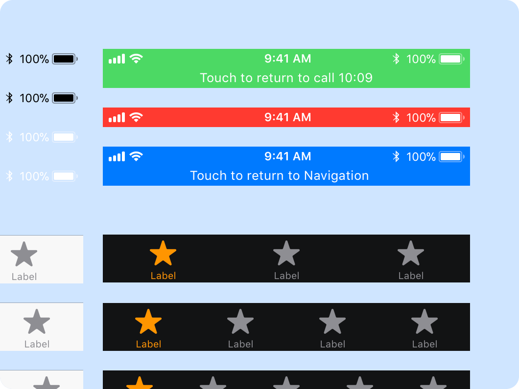
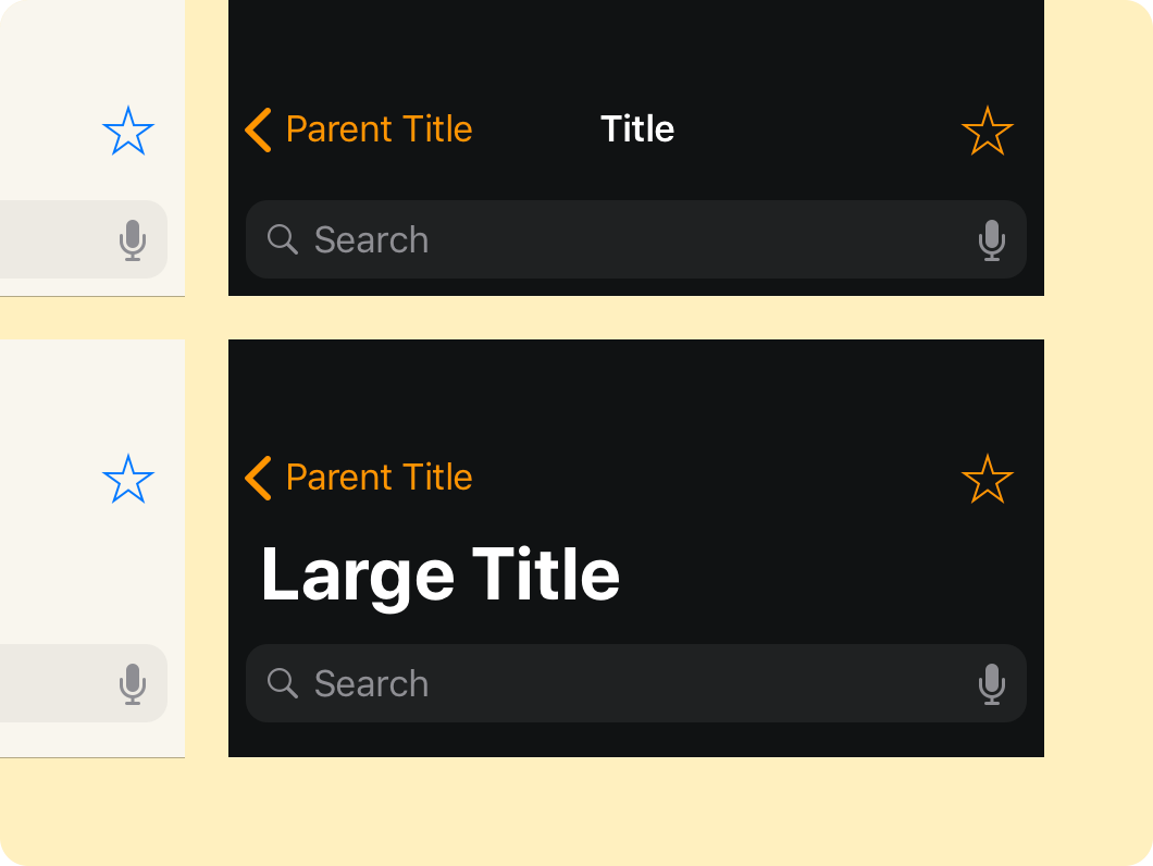
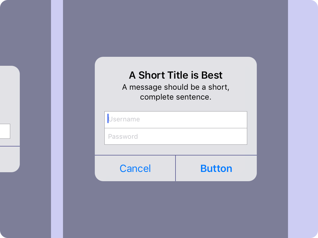
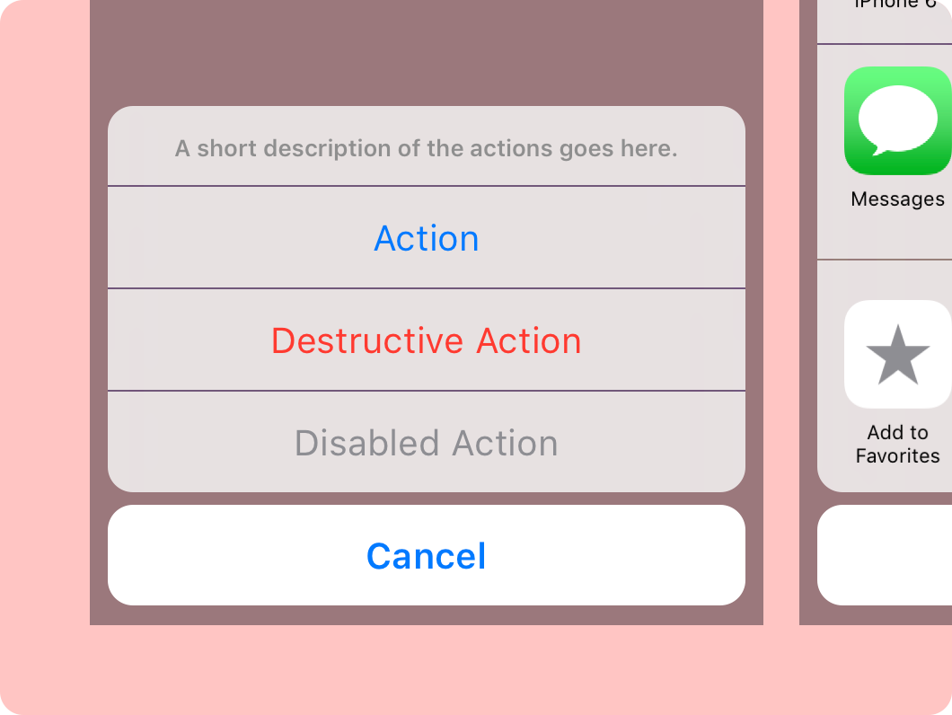
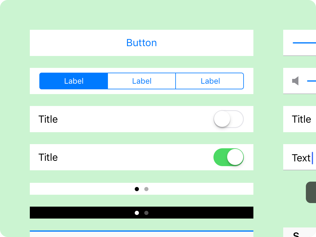
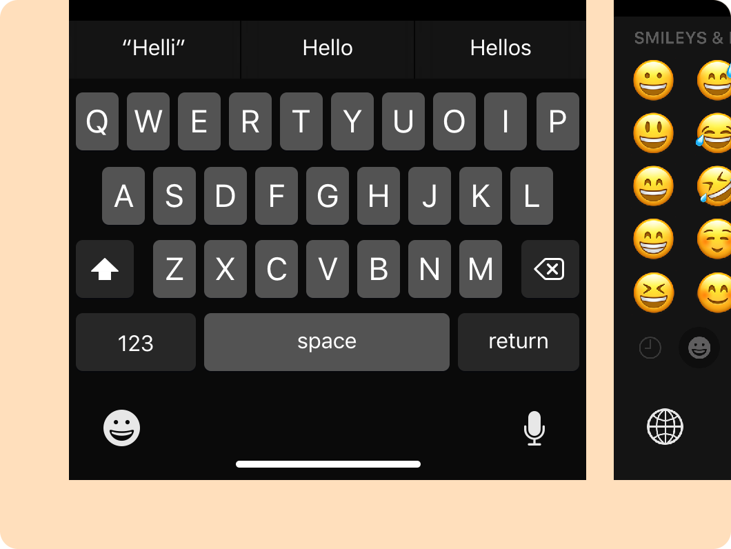
iOS 11 GUI for Framer

As a fan of Framer, I’ve been looking around for an iOS 11 GUI file but have thus far come up empty handed. So I made one myself. It took quite a while, but I have to say it’s a great experience for anyone looking to learn more about a new tool or a design system.

To use this system, make sure you have Framer installed on your macOS device. Also, download the San Fransisco Pro fonts from one of Apple's design resources.

There’s plenty of ways for this system to expand over time. Dark versions of all elements, iPad sizing, landscape orientation, and app screens, just to name a few. I’d also like to include prototypes for each interactive element in the system. If you’d like the see those updates sooner than I have the time to make them, feel free to contact me and put together a pull request on GitHub.

I hope this helps you dive into Framer prototyping more quickly, and have a little bit more fun making your ideas come to life.

You can keep up with updates and expansions here.

If Apple is serious about AR and VR, it should launch the next iPhone with a headset

Last month at WWDC, Apple introduced ARKit for iOS 11. This new kit, along with native VR support in Metal 2 on macOS, was the realization of Tim Cook's hints of interest in AR. I think from here there are some guesses you can make about where they might go next. But specifically I think their next move should be to make a head mounted case for the iPhone.

Experiencing AR through a phone that you're holding at arms length can lose the illusion pretty quickly. You're looking at the screen and the world around the screen at the same time so unless you lock you arms up and hold the phone right in front of your face, it's difficult to be convinced that what you're looking at is real. The phone becomes a kind of warped prism into another place. Also, what you're looking at is 1 dimensional, so you're brain doesn't put it into the physical space the same way that it would if you could really see depth.

While any company can make VR cases for the iPhone, I think that Apple should make one to improve the overall iPhone experience. Apple could integrate the headset with iOS so that as soon as you put the phone into the case, the user is given a VR interface to explore apps with VR optimized experiences and interfaces. This would mean that you don't have to ensure the phone it in "VR mode" before placing it into a case. And as soon as you remove it from the case, you would automatically be taken back to the normal iOS interface. 

Apple seems to have done a really amazing job using VIO to accurately understand the space you're in, and where the phone is in it. With a headset, the phone would be connected to a fixed position on your body which would let the software you're interacting with better understand where your face and body are in the virtual space. This would allow for things like animated characters being able to make eye contact with you or avoid running into you.

Looking at the leaks of the iPhone 8 so far, one could actually guess that Apple is already planning this. The non-Plus iPhone 8 is rumored to have two lenses which would help with spacially tracking rooms in 3D. The way that the lenses are positioned on the leaked phones also makes me think that they're optimizing for landscape viewing on the phone, an orientation that a headset would enforce.

We'll have to wait and see what Apple does. But one thing is clear - we're just at the start of mobile VR technology. This is touch screen phones in 2002. It's just a matter of increasing display quality, spacial tracking accuracy, and probably putting a phone on your face.

Making designs responsive

Designers should think about how their designs behave as the user’s screen size changes. Unfortunately, neither Photoshop nor Sketch - the most mainstream UI design tools - allow for this. Since there is a new generation of UI design tools cropping up, I thought I could lay out how a new tool would accomplish this.

In this post I refer to different parts of a UI in ways that other designers might not, so I made this little glossary:

  • View - All UI within the device's screen at any given point - relative to a specific "page" in an app.
  • Group - A section of the screen, such as a pane or a modal. Sometimes called components. I call them groups in this post since I'm speaking about layer groups.
  • Layer - An element of a UI's design - not synonymous with component in all cases.

View grids, group grids, and grid-based dimensions

View grids are pretty straight forward. With something like GuideGuide for Photoshop, they're easy to make too. The GuideGuide feature set should be standard in any interface design tool. 

To take it a step further, the GuideGuide type of grid creation should also associate with a group. You might have a group with some repeating layers: a profile picture, a name, and background area. If you put all those layers into a group called “person list” you should have the ability to set up an internal grid. That grid would define how much space you’re giving each layer in the UI. Certain columns can be flexible and certain columns can be fixed. For instance, you might always want the profile image to be fixed but you want the name area to be resizable. 

Now the groups within a view and the layers within a group are associated with guides. So if the designer ever goes in and moves the grid guides around, the layers and groups would adjust.

Percentage based dimensions, based on a group, layer, or view

Sometimes you don’t need the sophistication of a grid to arrange content. You just need to say “this input box will always be ’50% - 9px’ of the form width.” So there’s a few details there:

  • Layer dimensions should be able to be set as a percentage of a  group's dimensions
  • Group dimensions should be able to be set as a percentage of a  view's dimensions
  • Layer and group dimensions should be able to handle math

Relative positioning

What if you want to set distances between groups and layers using the same math that they use for dimensions? So the designer could say “keep this layer 18px to the right of this layer”. They could also say “keep this group 30px below this group”. If a text flow makes a group or layer taller, it doesn’t just overlap with another group or layer. It should be as easy as selecting two layers or groups and updating the relative position.

The designer could try to set impossible relative positions. The tool could provide errors or remove the oldest rule that makes the design impossible.

Min and max dimension constraints

If the designer wants to give something a lot of space the designer might want to give the group a way to scale up as the view gets larger. But at some point they would want it to stop scaling as it becomes no longer helpful - a max width. And as the screen gets smaller - a min width. Min and max widths could also be set with math or based on a grid for a group or view.

Breakpoints

So let’s zoom out a bit and think about the canvas as a whole. You could have a design that works from 300px to 700px. But once it gets to 750px things start to get weird, so you need to set a new size range and adjust sizes and positioning.

Breakpoints adjust a view's positioning and size attributes, down to the individual layer. In each breakpoint, there could be content changes in the view. But there should be far more similarities than differences since it’s the same view in an app. You may want to update existing content in one breakpoint - the copy, or a layer style. If you did, that update would propagate across all breakpoints.

iPad Pro mini and the chase for the right screen size

Currently, there’s three different screen sizes for the iPad. The 9.7” 264 ppi display on iPad Air and iPad Air 2, the 7.9” 326 ppi display on iPad mini 2 and 4, and the 12.9” 264 ppi display on iPad Pro. iPad mini was introduced just two years after the introduction of the original iPad, iPad Pro was introduced just three years after that.

If I had to take a guess at what the next iPad would look like in two or three years from now, I think it would be something that’s pretty obvious from the screen sizes listed above.

The iPad mini was a scaling of the iPad’s ppi so that it was the same as the iPhone. I think the next iPad will be the same scaling again from 264 ppi to 326 ppi, but from iPad Pro rather than from iPad.

So that’s a 10.47” 326 ppi display at 2732px by 2048px. But Apple wouldn’t just make a new iPad with this screen size because it solves a fun math problem. I think the screen size and pixel density actually make a lot of sense. For the person that wants to replace their computer with an iPad, they aren’t doing it so that they can have a better notebook computer. They’re doing it so they can use a great tablet. iPad Pro is too unwieldy for most people to use as a regular tablet. At the same time, the iPad Air doesn’t feel as powerful as the Pro because you simply can’t fill the screen with content like it’s a notebook computer.

I think the device would be large enough to warrant the technology advances that were brought to iPad Pro - the Smart Connector, Apple Pencil, etc. It would also bring the inherent ergonomic advantages - more roomy canvas for drawing, comfortable on-screen keyboard, etc.  This iPad could optionally use Display Zoom to render the display at a 264 ppi equivalent. That would mean that the device wouldn't necessarily ignore people who like the interface sizing of the less pixel dense iPads. For the person who wants a powerful tablet, but doesn't want to break their wrists or the bank, this could be a great product. In many ways it would be an iPad Pro mini. But I think Apple should just call it iPad.


Update

Apple announced a 10.5" iPad Pro on June 5, 2017. I was off by .03", 62 ppi, and the name of the device, which ended up going to their low-end 9.7" iPad.

Thoughts on Apple’s 2016 Mac Lineup

Since the 'Hey Siri' event, some Mac fans have gotten upset over the lack of innovation that that Mac has had. I see things in a different way. I think the Mac market is going to remain strong - especially for work. Apple has proven that it doesn't mind spreading it's attention away from the iPhone.

To me, the Mac belonging to the same company that's making the iPhone is actually a strength for the Mac. Apps like Reminders, Maps, FaceTime, and Notes might not have been a part of a Mac. Not without the work that Apple did on iOS. Though - to be clear - expecting that Apple would spend as much time on the Mac as the iPhone defies logic. Or at least ignores the dollar signs.

So, with optimism, I lay out my thoughts on what Apple will do with the Mac in 2016. For starters, it's out with the old. The non-retina 27-inch iMac, and non-retina 13-inch MacBook Pro are out.

OS X 10.12

The main theme of 10.12 is centralization and consistency. Continuity 2.0.

iCloud Account Management

Connect accounts like Dropbox or Foursquare with iCloud. You can have all your services set up across all your devices - no thinking required. Just sign in with your Apple ID and you're set. This is an extension of iCloud Keychain. But, it's actually signing you into apps and accounts which are linked to our device's OS or the apps within it.

Siri

This also means that you can expect your experiences to travel with you to the Mac, now including Siri. Integrated with Spotlight, Siri automatically gives you suggestions before you even start typing. Spotlight is also now a Launchpad page.

Universal Apps and Centralized App Store

In the effort of centralization, the App Store is now the central App Store for both iOS and the Mac. This allows users to instantly see which devices an app supports and it allows developers to be rewarded when they make apps for a user's entire ecosystem of devices. Users would be able to remotely install apps on their iOS device from their Mac (and vice versa). Part of this could also happen with App Thinning, a new technology for iOS that allows users to only download the parts of their app that are relevant to the device they want to use it on. 

iCloud-based Notification Settings

If you're using the same iCloud account, notification settings could be mirrored across devices. Including Mac. Notifications without a Mac app would give the user options to open it on their iOS device. Or the app’s web app if it had one.

And here's a handful of other features and optimizations:

  • Low Power Mode

  • Touch ID support for sign in, system authentication, purchasing, and accessing secure apps

  • Native and third-party cellular support for setup, data usage tracking, and signal strength

  • News, Health, Voice Memos, Weather, Stocks, Find My Friends, and Wallet apps

  • Discontinuation of Dashboard

MacBook

MacBook is a pretty great device, and I don't think it makes sense to revamp the product in it's second year. The coolest update is another new trackpad, this time with Touch ID. Also, there's a new option to have a built in cellular antenna which uses an Apple SIM just like the iPad.

On the technology side, the USB-C port gets an update to support Thunderbolt 3 as well. Typical processor and graphics updates along with a Bluetooth update to 4.2.

MacBook Air

MacBook Air won't get a revamp either, but that's because this device is on it's way out the door, getting replaced with the (even airier than the Air) MacBook. So just technology updates. All USB 3 and Thunderbolt 2 ports are removed, being replaced by 3 USB-C + Thunderbolt 3 ports. The processors, graphics, and Bluetooth antenna also get an update.

MacBook Pro

I think it would actually make sense for MacBook Pro's design to get a bit of a refresh. The current design is still based on the unibody design that was established 8 years ago. Next year, the notebook will have had the exact same design for 4 years. So making it a bit thinner and lighter would be great, and there's a few new things that the MacBook is doing that could easily be brought to the MacBook Pro. The thinner keyboard, the tapered battery, new aluminium color options, and a more energy-efficient Retina display with larger pixel apertures. Like the MacBook, the Pro would also get a Touch ID trackpad.

And of course the regular technology updates. All USB 3 and Thunderbolt 2 ports would be removed. Three USB-C + Thunderbolt 3 ports would take their place. Two on the left side and one on the right. The processor, graphics, and Bluetooth antenna would also be updated. The graphics and USB-C + Thunderbolt 3 port mean that MacBook Pro now supports an external 5K display.

iMac

With the non-retina 27" iMac out the window comes the introduction of the 21.5-inch iMac with Retina display. But other than that, these computers are fine, only needing new technology. Getting any Mac with a HDD should no longer be possible, so a Fusion drive or SSD are the only options available. Also new processors, graphics, and Bluetooth connection upgraded to 4.2.

Mac Pro

Mac Pro has a long road ahead of it. At this stop on the road, it's just getting technology updates. All USB 3 and Thunderbolt 2 ports are removed, being replaced with 8 USB-C + Thunderbolt 3 ports. The processors, graphics, and Bluetooth antenna should also be updated.

Mac Mini

Much like the Mac Pro, the Mini's design has a long life ahead of it, so there isn't much of a need to redesign it at this point. It'll get the same 'no HDDs allowed' rule as the iMac. So just SSDs and Fusion Drives. The USB 3 and Thunderbolt 2 ports are removed, being replaced by 5 USD-C + Thunderbolt 3 ports. With a new processor, graphics card, and Bluetooth antenna, it should also support an external retina 5K display.

Apple Retina 5K Display

  • Retina 5K resolution

  • Built-in FaceTime HD camera with microphone

  • Built-in 2.1 speaker system

  • Detachable MagSafe 2 cable

  • Detachable USB C + Thunderbolt 3 cable

  • USB-C + Thunderbolt 3 input (x4)

  • HDMI 2.0 input

  • 3.5-mm stereo headphone minijack

  • Gigabit Ethernet

  • Similar industrial design to the iMac

Magic Trackpad + Magic Mouse

These interfaces get some nice updates including an integration of Touch ID into the surface of the trackpad and the top of the mouse. The batteries should be integrated, allowing for much longer battery life. Just like the Siri Remote, charging would happen via a Lightening cable. Also to increase both battery life and connection strength, the devices would be updated to Bluetooth 4.2.

Magic Controller

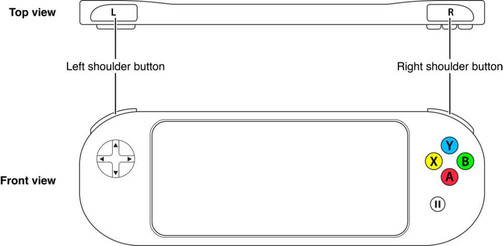
In El Capitan, Apple added some surprising new frameworks to help developers make gaming on the Mac a little better. So while gaming isn't a core strength of Apple's, I don't think they dislike it by any means. There has been documentation for developers to support game controllers on iOS and OS X for a little while now, so I think it only makes sense for Apple to put it's hat in the ring. The controller would support an accelerometer and gyroscope. It would have an integrated battery, being charged via a lightening cable. With Bluetooth 4.2, battery life would be great as well.

Apple Wireless Keyboard

Super minor update to give it Bluetooth 4.2 and an integrated battery that's charged with a Lightening cable. Noticing a pattern?


A Better Software Purchasing Model

Currently, there are a few different ways to buy software, each with their own drawbacks.

The Box Model

2014-05-17 17.22.05.png

There's what I would call the "Box Model" where you buy software at a somewhat high price. In the Box Model, you get free access to updates for that version of the software. Eventually, the developer will drop support of the software meaning that you have to buy the new version of the software and repeat that process again to keep getting updates. But even if the developer drops support for the software, you still get to keep it on your device without any problem. Sometimes you can get the next version of the software at a discount if you own the old version, but that isn't really guaranteed.

This model is great if you buy the software the day it's released, but the closer you get to buying the software to the time of the software's next iteration release, the lower the value. If you buy the software the day before the next version comes out, you're probably going to be upset because you didn't get to enjoy that year of free updates like the person who bought it a year ago did.

The Subscription Model

The Subscription Model solves some of the problems that go along with the Box Model, but it introduces new ones. With the subscription model, you buy access to software and updates, usually on a monthly basis. The price will be lower than the Box Model at first, but you'll also lose access to the software if you stop paying the subscription.

My Proposal: The Access to Updates Model

So now my proposal. I think it would make sense if you could buy software along with a pass to get updates over a certain time period. So you could buy "Microsoft Word + 24 Months of Updates." At the end of the 24 months, you would no longer receive updates, but you would also be able to keep the software. You get the best of both worlds. There's no worry about buying the software at the right time, and no worry about losing access to the software. 

In this model, companies could also add value for buying longer periods of access. 1 year would be $100, 2 years would be $150, etc. And you would always be able to buy more time to access updates whenever you wanted. If you thought you would always want updates, you could just say that you want to set up auto-payments on a yearly basis (companies would probably give you a discount if you chose this option). 

An iPad for Everyone

Currently, there are three iPad models: iPad mini, iPad 2, and iPad with Retina display. Their prices start at $330, $400, and $500 respectively. While iPad mini and iPad with Retina display are relatively new products (they're both only a year old), iPad 2 has been sold for the last three years. This is something that Apple has done for a while with their iPhone line. But, with iPhone 5c, they've shown that low-end products don't necessarily have to be old products.

Meanwhile, Apple is losing some mindshare to Google's Nexus 7, a perfectly good tablet that starts at just $230. That tablet's display is - while a bit smaller - well into retina territory (an attribute that iPad mini doesn't yet possess).

Apple has shown that retina screens aren't necessary to sell tablets with the sale of the non-retina iPad mini and iPad 2. But they are great if you're willing to pay a little more. That's why I don't think that Apple should ditch the non-retina iPad. They just need to keep those models fresh like they did with iPhone 5c. Here's an iPad lineup that reflects some of these ideas:

  • $500 - iPad S - A7X - 32GB, 64GB, 128GB
  • $400 - iPad C - A7 - 32GB, 64GB, 128GB
  • $350 - iPad Mini S - A6X -  16GB, 32GB, 64GB
  • $250 - iPad Mini C - A6 - 16GB, 32GB, 64GB

The "S" iPad models would have retina displays and aluminium backs. The "C" models would have regular density displays and colored plastic backs just like iPhone 5c. "S" models could also include some new features like an improved camera and Touch ID while the "C" models would lack those features.

The price of the cellular antenna option is also too expensive; it currently costs $130. On the Nexus 7 that upgrade only costs $80. I think asking $100 for an LTE antenna is a bit more reasonable. If they could match Google's $80 that would be great, but I'm not holding my breathe. Storage upgrades would continue to cost $100 per tier.

When the iPad was first released, no one could compete with Apple on price. Companies like Motorola and Samsung struggled to get their tablets below $700.  But times have changed and the competition is making great products at low prices. Apple has dipped its toes into the low end market by keeping the iPad 2 on the shelf and introducing the iPad mini. But it needs to take a real stake in that part of the market if it wants to keep its tablet market share high.

And it definitely would. The iPad continues to have the best tablet apps. If Apple makes its iPad even more appealing to a customer's wallet, that customer would have no reason to look at the competition.

Nexus 4 Review

Prelude to Google

In August of last year I woke up and stretched my arms. Before I knew it, water was flowing over my naked iPhone 4 (my case was across the room in my backpack). The rice bowl didn’t come soon enough and my iPhone began its long spiral towards brickage. I was waiting on the iPhone 5 to be announced so I decided I would use my upgrade to get a 3GS and I would use my dad’s upgrade to get the 5. That plan failed when my family decided we didn’t want contracts. So for the last 9 months, I’ve been using that seemingly temporary 3GS.

Which has been hell. It was this experience that made me want to get a top notch device. But I also didn’t want to spend all of my money (college students aren’t usually drowning in cash). So unless I was willing to spend $650 plus tax, the Nexus 4 was my answer. Plus, I've only heard good things about Android as of late, so I thought it was worth a shot. 

Design

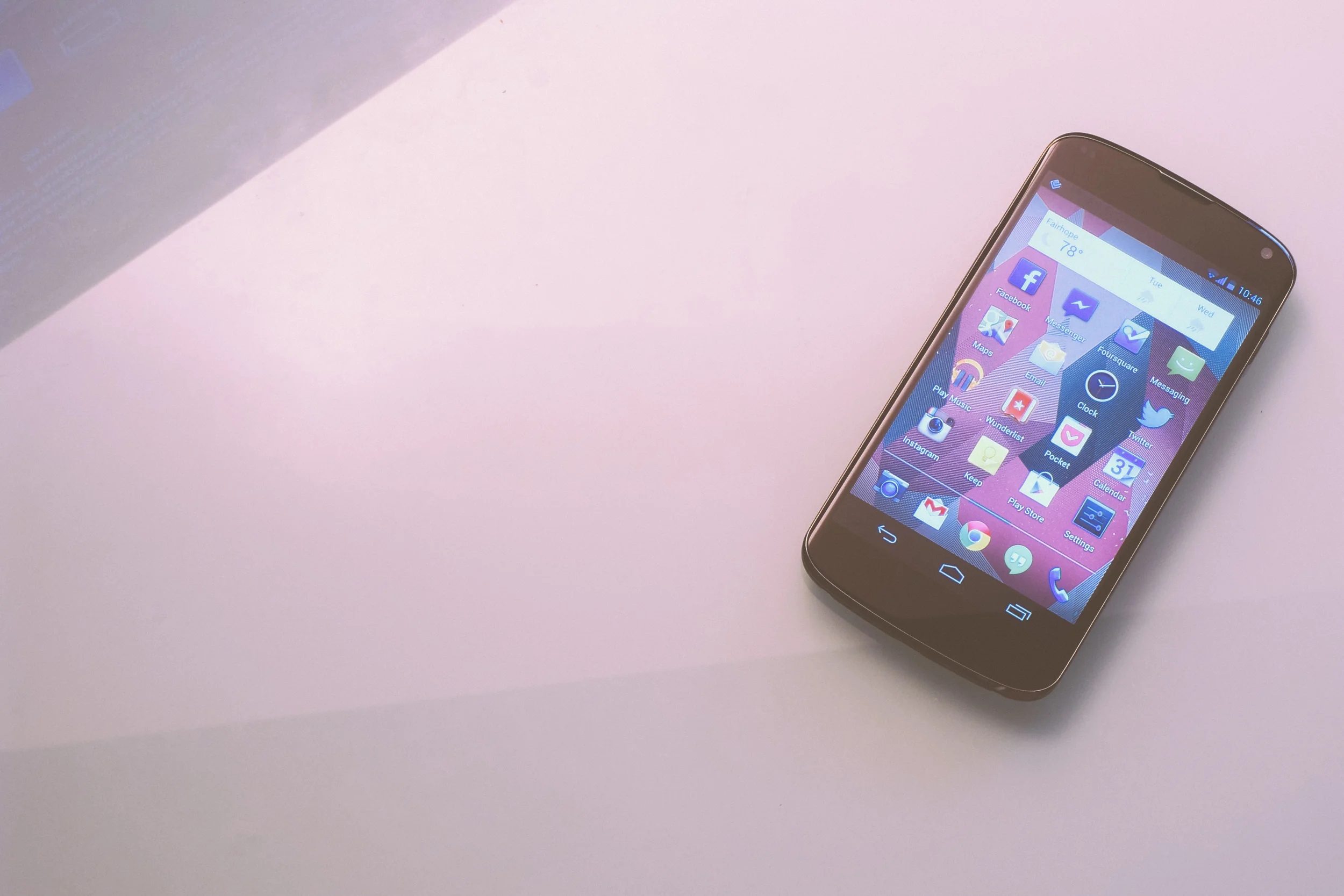
While the Nexus feels nice in the hand, it leaves a lot to be desired. It’s clearly made with less precision than the last few generations of iPhone. A metallic band frames the glass front of the phone. That glass curves on the sides (something that is especially nice when flipping between horizontal views). The sides of the phone are covered with a soft rubbery material. The back is made of glass with a reflective dot pattern which is relatively unobnoxious. I would have preferred the rubbery material covered the entire back, though that probably would have made it thicker. Speaking of mass, the device was surprisingly thin and light; even though it’s big phone, I hardly feel it in my pocket.

100_3834.jpg

The headphone jack is on the top (wish it was on the bottom), the speaker is on the back (wish that was on the front) and the power button is on the side (which is nice).

There are only software buttons on the front of the device, which I actually got used to really quickly.

Performance

Coming from the 3GS, the camera is perfectly fine. The front facing camera also gets the job done when it comes to mobile video conferencing or sending Snaps.

Navigating around the device is really quick; its only had a handful of hiccups which were probably software related. I recently installed Minecraft which literally hasn’t once skipped a beat.

Battery life was disappointing at first, but I’ve managed to get into a habit of charging it whenever possible. This practice keeps it above 60% throughout the day.

Call quality is great when the reception is great. With the lack of LTE, that kind of reception might be harder to come by for some people.

OS

The lock screen is pretty bad. At least it’s bad if you try to flip between widgets. In order to do that you have to expand them. But once you expand them, you have to contract them if you want to unlock the device. Needless to say, it would have made more sense to keep the widgets permanently contracted so that you could switch between them from the get go, and also unlock the device at any moment.

I installed Apex Launcher a few days after unboxing the device and I haven’t had a reason to go back. So much for stock Android. Basically, I got rid of the app drawer button and made it so that if you tap the home button when you’re on the home screen, you open the app drawer. I also removed the Google search bar from the top of the home screen and replaced it with a Google Now widget, which I though made infinitely more sense. I’m not sure why there are more home screens than you have icons for.

100_3845.jpg

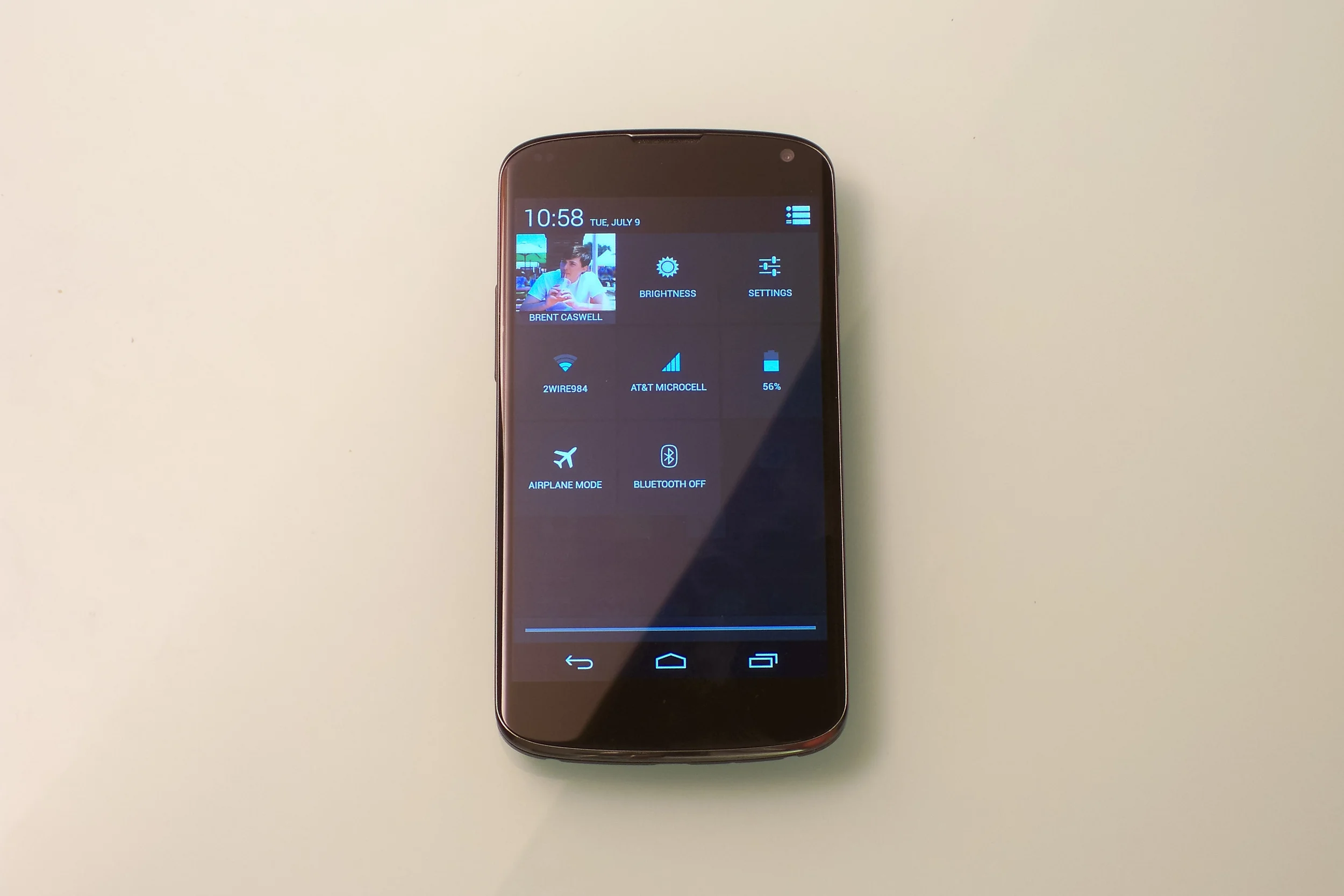
But there are a lot of things that Android does well. While icons won’t display a badge to show an unread notification, there are little notification icons that appear on the left side of the status bar. Pulling down on the status bar shows you controls if you have something like a podcast playing. You can also delete emails directly from Android’s notification center. If I receive a Facebook message on my phone but instead reply to it on my computer, the notification on my phone disappears instantly. This is far better than the notification experience on iOS.

This was a pattern throughout Android. Google often takes risks in order to give the user more power, whereas Apple simplifies their apps in order to keep their users from getting confused. Google’s risk-taking was often for the best and I felt like I was able to do more things more efficiently than on iOS. But I sometimes found that Google’s strategy was done too fast and loose, leaving the user in a confused position.

Stock Apps

The core apps that come installed with Jelly Bean are far from polished. They should be super over-developed if Google really wants to show Android app developers what their platform is capable of. I could go through a list of all the small things that bothered me, but I want to keep the review at least somewhat high-level.

UIs were generally unclear, too often leaving the user tapping around to figure out where a menu might lead or what an icon meant. Simple apps like People would crash, and phantom buttons would disappear when tapped. Where on iOS, buttons exist within disciplining dimensions, Android’s touch targets didn’t seem to have any kind of limits. The Calculator app for example has buttons that are laughably huge (which is disappointing when you realize that the advanced panel has to be hidden on a separate screen). The Messaging app’s bottom bar could easily be done away with because its icons could fit on the top bar. Now I’m just going through all my nit-picks.

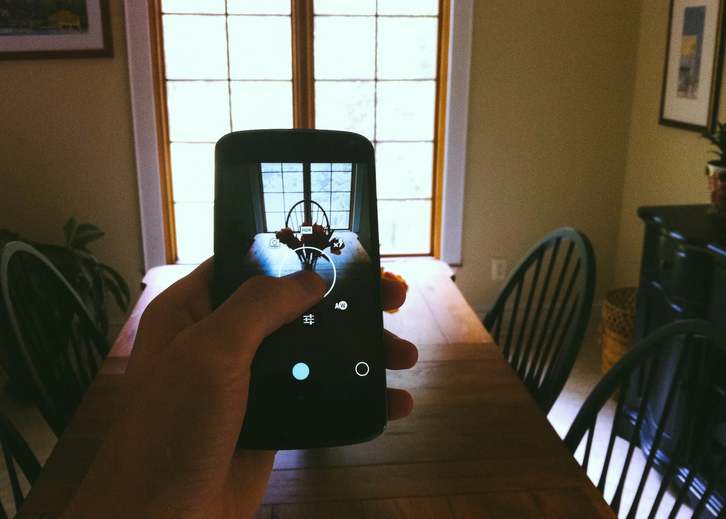
Once again, it isn’t all bad. The Camera is an example of an app done right. By holding down on the camera view an options circle pops up. Scrolling your finger around the circle selects an option.

2013-06-26 14.37.23.jpg

Generally, I think Apple’s apps have been given more thought. I felt like Google didn’t give their stock apps any thought at all a few times too many.

Google Now

Google Now is another example of something that Google got right. For those who don’t know, Google Now is the search giant’s version of Siri. But it’s very much its own version. Google Now shows the user information automatically rather than waiting on the user to ask it questions. For some, this might feel intrusive, for me it was delightful.

2013-06-26 13.24.39.jpg

At one point I was talking to my family about going to see a movie. When I opened Google Now, the “movies now playing” card was front and center. Pretty freaky stuff.

You have to be connected to the internet for Now’s functionality to work (this is also the case for Apple’s intelligent assistant). Android does allow for 3rd party apps to use offline voice recognition. What would be great is if things like launching an app, audio playback, or dialing could be done using this same tech, but I guess we’ll have to wait for that. In any case, Google has clearly beat Apple at their own game. I’m really looking forward to what Google Now will be able to do for me in the future.

Final Thoughts

After using Android for a few weeks, I’ve decided that there are enough things about the platform that I prefer to iOS for it to be worth the stay. I like the large screen of the Nexus 4. I like that you can only show certain apps on the homescreen, hiding irregular apps in the app drawer. I like notifications and the quick-settings pull down menu. These are all great advances over the competition.

But, on the other hand, I would completely understand someone wanting to side with Apple. iOS is simply a more polished platform. From the icons to the code, it’s simply more elegant.

Importantly, though, for its cost the Nexus 4 is unbeatable. The 3-year-old iPhone 4 costs $100 more with half the storage capacity. And that’s the cheapest new iPhone you can buy off contract.

For me, it was completely worth the savings.

A Smarter Contact File

100_3916.jpg

As new technologies are made, they seem to leave old technologies behind, stagnant and in the distance. Take for example the contact information that is used for web services like iCloud or Gmail. The contacts list and its data are manually created by users. Eventually, a long, precious, list of people is made. But every time one of those people gets a new phone number, or moves to a new apartment, or gets a new job with a new email address, you have to update that information manually. Except most people don't update that information, or there are several contact entries for the same person, or the contact information simply isn't recorded. The user scratches their head and pains to remember their address every time they need to send them an email.

But then you look at something like Facebook. With Facebook, the user doesn't have to know anything besides the name of the person they're trying to contact. And if you're wondering what someone's workplace is, look no further than their constantly up-to-date profile page.

So why isn't your collection of contacts on Gmail, iCloud, or Outlook that intelligent? Why is it that contact cards aren't updated automatically based on what you're contacts chose to share? I think they should, and here's how.

When you're creating a new contact, the first entry would be a username. Once you enter the person's username, the contact card would automatically fill with the information that that person allows to be seen by the public. A button would appear that says "request contact information." Once tapped, the person who you're trying to add would get a prompt saying that you want access to their info (just like a friend request). They approve, and you're phone downloads their (constantly up to date) contact information.

Unfortunately, this technology would inevitably be proprietary. But because most people have accounts on more than one service, that probably wouldn't be a huge impediment. 

There is clearly a hybrid of this system today; iOS allows for its users to sync their Facebook and Twitter accounts with their contact list. But you have to update the content manually and the experience is far from ideal. 

If companies like Apple and Google would take a few notes from their social networking buddies, customers would probably be a lot happier.