Prelude to Google
In August of last year I woke up and stretched my arms. Before I knew it, water was flowing over my naked iPhone 4 (my case was across the room in my backpack). The rice bowl didn’t come soon enough and my iPhone began its long spiral towards brickage. I was waiting on the iPhone 5 to be announced so I decided I would use my upgrade to get a 3GS and I would use my dad’s upgrade to get the 5. That plan failed when my family decided we didn’t want contracts. So for the last 9 months, I’ve been using that seemingly temporary 3GS.
Which has been hell. It was this experience that made me want to get a top notch device. But I also didn’t want to spend all of my money (college students aren’t usually drowning in cash). So unless I was willing to spend $650 plus tax, the Nexus 4 was my answer. Plus, I've only heard good things about Android as of late, so I thought it was worth a shot.
Design
While the Nexus feels nice in the hand, it leaves a lot to be desired. It’s clearly made with less precision than the last few generations of iPhone. A metallic band frames the glass front of the phone. That glass curves on the sides (something that is especially nice when flipping between horizontal views). The sides of the phone are covered with a soft rubbery material. The back is made of glass with a reflective dot pattern which is relatively unobnoxious. I would have preferred the rubbery material covered the entire back, though that probably would have made it thicker. Speaking of mass, the device was surprisingly thin and light; even though it’s big phone, I hardly feel it in my pocket.
The headphone jack is on the top (wish it was on the bottom), the speaker is on the back (wish that was on the front) and the power button is on the side (which is nice).
There are only software buttons on the front of the device, which I actually got used to really quickly.
Performance
Coming from the 3GS, the camera is perfectly fine. The front facing camera also gets the job done when it comes to mobile video conferencing or sending Snaps.
Navigating around the device is really quick; its only had a handful of hiccups which were probably software related. I recently installed Minecraft which literally hasn’t once skipped a beat.
Battery life was disappointing at first, but I’ve managed to get into a habit of charging it whenever possible. This practice keeps it above 60% throughout the day.
Call quality is great when the reception is great. With the lack of LTE, that kind of reception might be harder to come by for some people.
OS
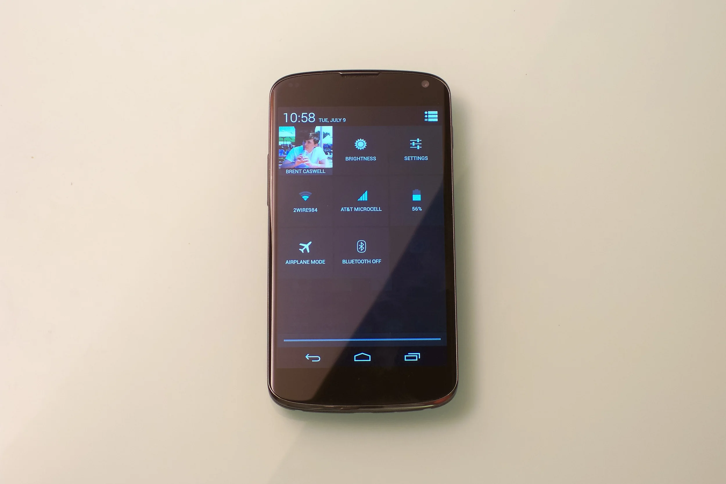
The lock screen is pretty bad. At least it’s bad if you try to flip between widgets. In order to do that you have to expand them. But once you expand them, you have to contract them if you want to unlock the device. Needless to say, it would have made more sense to keep the widgets permanently contracted so that you could switch between them from the get go, and also unlock the device at any moment.
I installed Apex Launcher a few days after unboxing the device and I haven’t had a reason to go back. So much for stock Android. Basically, I got rid of the app drawer button and made it so that if you tap the home button when you’re on the home screen, you open the app drawer. I also removed the Google search bar from the top of the home screen and replaced it with a Google Now widget, which I though made infinitely more sense. I’m not sure why there are more home screens than you have icons for.
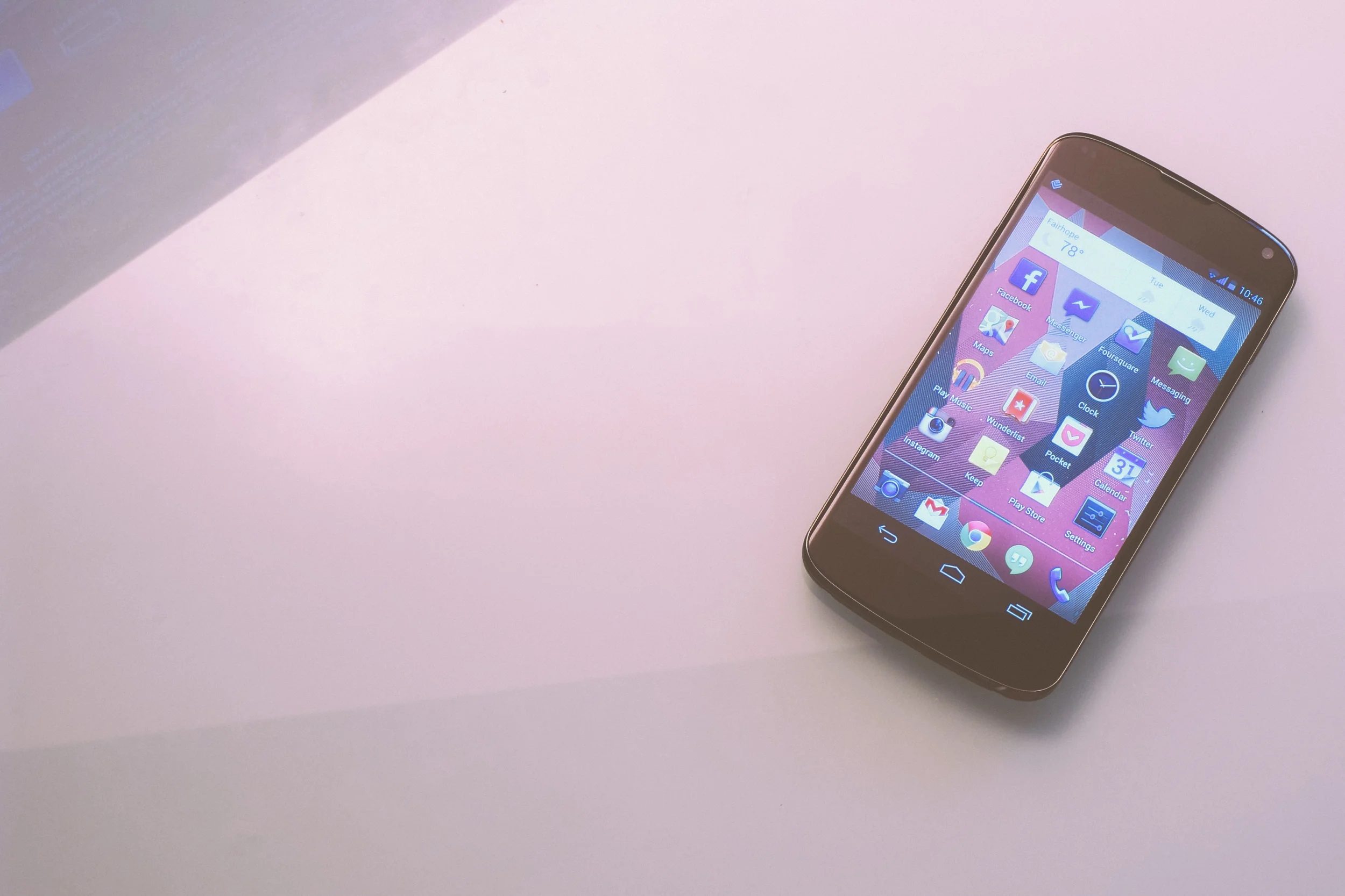
But there are a lot of things that Android does well. While icons won’t display a badge to show an unread notification, there are little notification icons that appear on the left side of the status bar. Pulling down on the status bar shows you controls if you have something like a podcast playing. You can also delete emails directly from Android’s notification center. If I receive a Facebook message on my phone but instead reply to it on my computer, the notification on my phone disappears instantly. This is far better than the notification experience on iOS.
This was a pattern throughout Android. Google often takes risks in order to give the user more power, whereas Apple simplifies their apps in order to keep their users from getting confused. Google’s risk-taking was often for the best and I felt like I was able to do more things more efficiently than on iOS. But I sometimes found that Google’s strategy was done too fast and loose, leaving the user in a confused position.
Stock Apps
The core apps that come installed with Jelly Bean are far from polished. They should be super over-developed if Google really wants to show Android app developers what their platform is capable of. I could go through a list of all the small things that bothered me, but I want to keep the review at least somewhat high-level.
UIs were generally unclear, too often leaving the user tapping around to figure out where a menu might lead or what an icon meant. Simple apps like People would crash, and phantom buttons would disappear when tapped. Where on iOS, buttons exist within disciplining dimensions, Android’s touch targets didn’t seem to have any kind of limits. The Calculator app for example has buttons that are laughably huge (which is disappointing when you realize that the advanced panel has to be hidden on a separate screen). The Messaging app’s bottom bar could easily be done away with because its icons could fit on the top bar. Now I’m just going through all my nit-picks.
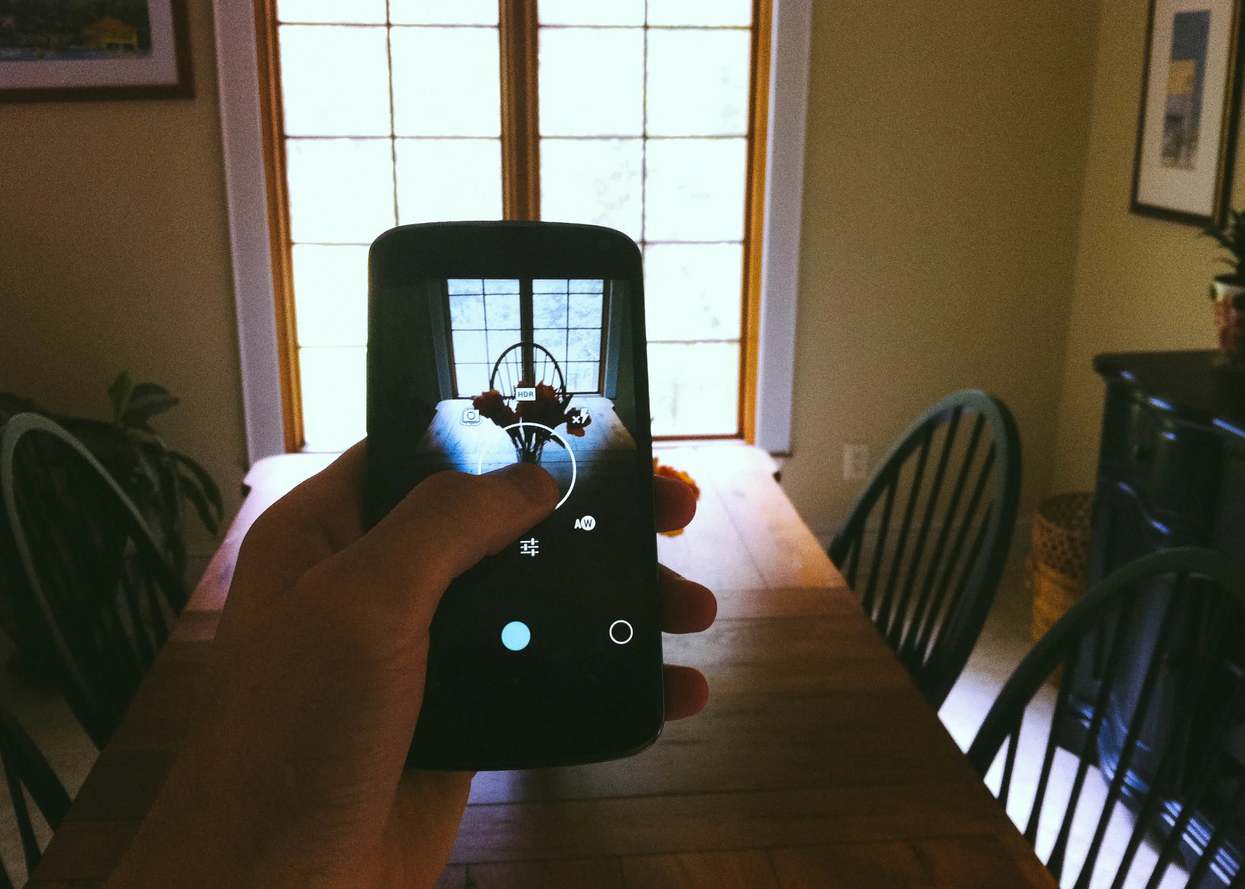
Once again, it isn’t all bad. The Camera is an example of an app done right. By holding down on the camera view an options circle pops up. Scrolling your finger around the circle selects an option.
Generally, I think Apple’s apps have been given more thought. I felt like Google didn’t give their stock apps any thought at all a few times too many.
Google Now
Google Now is another example of something that Google got right. For those who don’t know, Google Now is the search giant’s version of Siri. But it’s very much its own version. Google Now shows the user information automatically rather than waiting on the user to ask it questions. For some, this might feel intrusive, for me it was delightful.
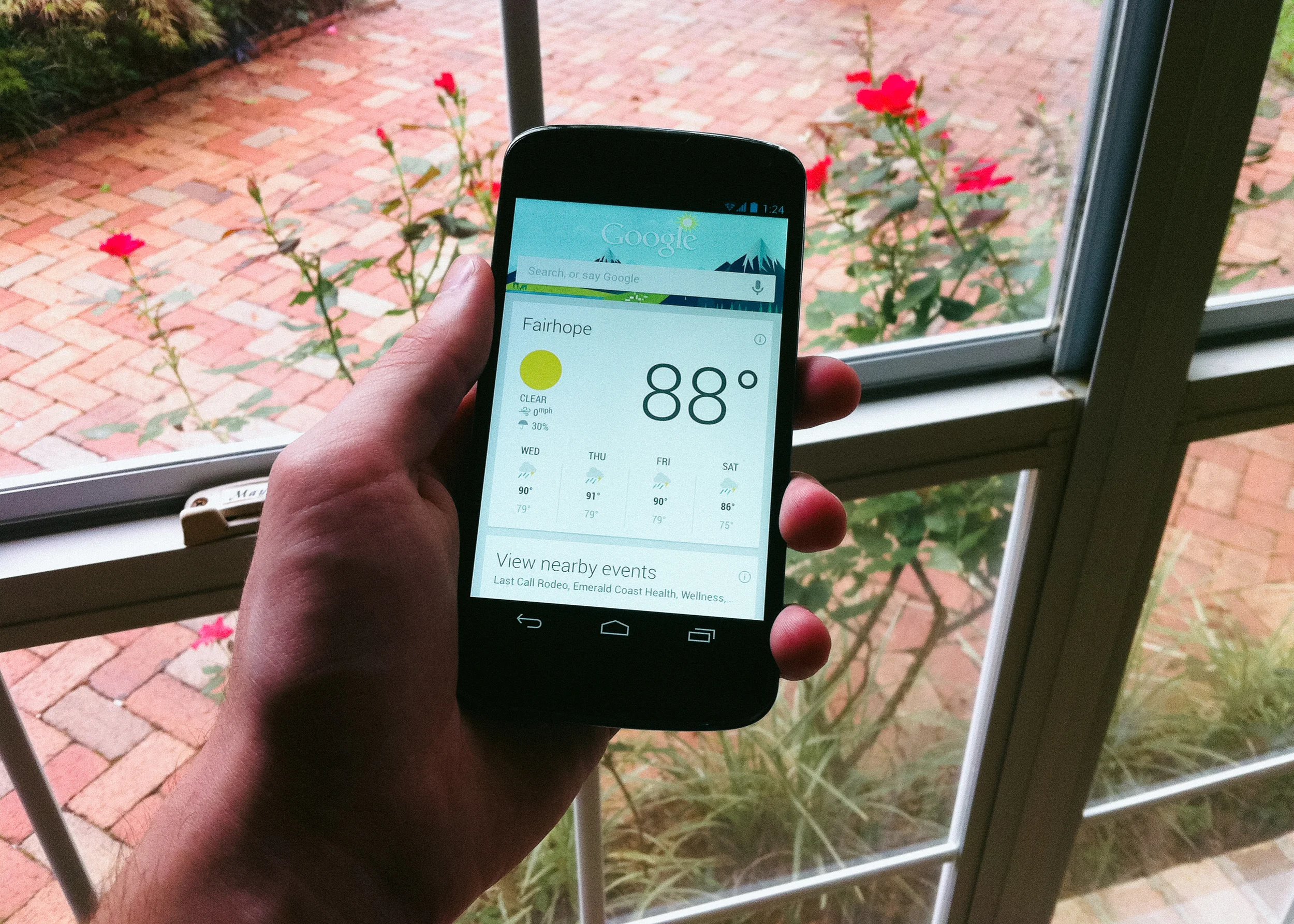
At one point I was talking to my family about going to see a movie. When I opened Google Now, the “movies now playing” card was front and center. Pretty freaky stuff.
You have to be connected to the internet for Now’s functionality to work (this is also the case for Apple’s intelligent assistant). Android does allow for 3rd party apps to use offline voice recognition. What would be great is if things like launching an app, audio playback, or dialing could be done using this same tech, but I guess we’ll have to wait for that. In any case, Google has clearly beat Apple at their own game. I’m really looking forward to what Google Now will be able to do for me in the future.
Final Thoughts
After using Android for a few weeks, I’ve decided that there are enough things about the platform that I prefer to iOS for it to be worth the stay. I like the large screen of the Nexus 4. I like that you can only show certain apps on the homescreen, hiding irregular apps in the app drawer. I like notifications and the quick-settings pull down menu. These are all great advances over the competition.
But, on the other hand, I would completely understand someone wanting to side with Apple. iOS is simply a more polished platform. From the icons to the code, it’s simply more elegant.
Importantly, though, for its cost the Nexus 4 is unbeatable. The 3-year-old iPhone 4 costs $100 more with half the storage capacity. And that’s the cheapest new iPhone you can buy off contract.
For me, it was completely worth the savings.