Xfinity Navigation Redesign
Company: Comcast
Platform: Web
Year: 2018
Project Design Team Size: 1 User Experience Designer, 1 Visual Designer
Starting small
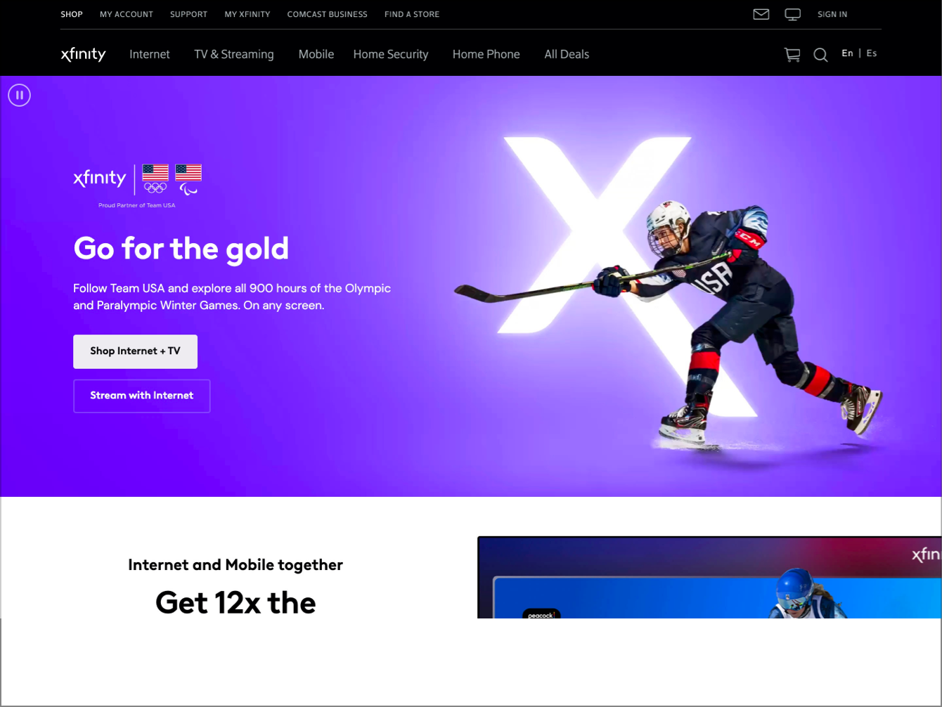
In 2018, I worked on the Xfinity team helping to drive forward design across a couple of projects over the course of about a year. One project that I am particularly proud of was redesigning the brand’s navigation system. Our main goal was to make sure that it was clear to customers what products and services Xfinity provided with the ultimate goal of increasing online sales.
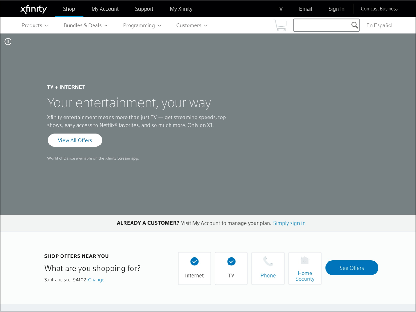
This was not the first time that they had attempted to redesign the navigation bar. A few years before I started on the team, they had set out to redesign the navigation bar. But, as time went on and the project continued, its scope increased and ultimately snowballed into an extremely large project that could not conceivably be completed without being broken down into smaller pieces. There was a desire at the time to create one universal navigation bar that could be used across all Xfinity applications regardless of the customer phase or the goals of the customer. That track of work was shelved because it was impossible to justify the engineering costs of reimplementing all navigation menus across the company for the sake of “purified information architecture”.
I tried to take a different approach to this project. Instead of thinking about the entire Xfinity ecosystem I focused particularly on what the customer was trying to achieve when signing up for service. This would be the actual customer goal for the part of the experience that this navigation bar was associated with. I also tried to frame the objective of the redesign not as a perfect solution to an extremely complex problem but instead as a performance-measurable change on the website. I positioned the redesign as the B in an A/B test. So if the new design didn't increase sales, time on site, or any other key performance indicator, then we would simply end the test and revert back to what we had before. This allowed stakeholders and executives at Xfinity to feel comfortable with the project itself and get creative about what changes we could propose. It was zero risk to them and the upside was tremendous and that we could potentially increase sales without having to create a new product offering or marketing campaign.
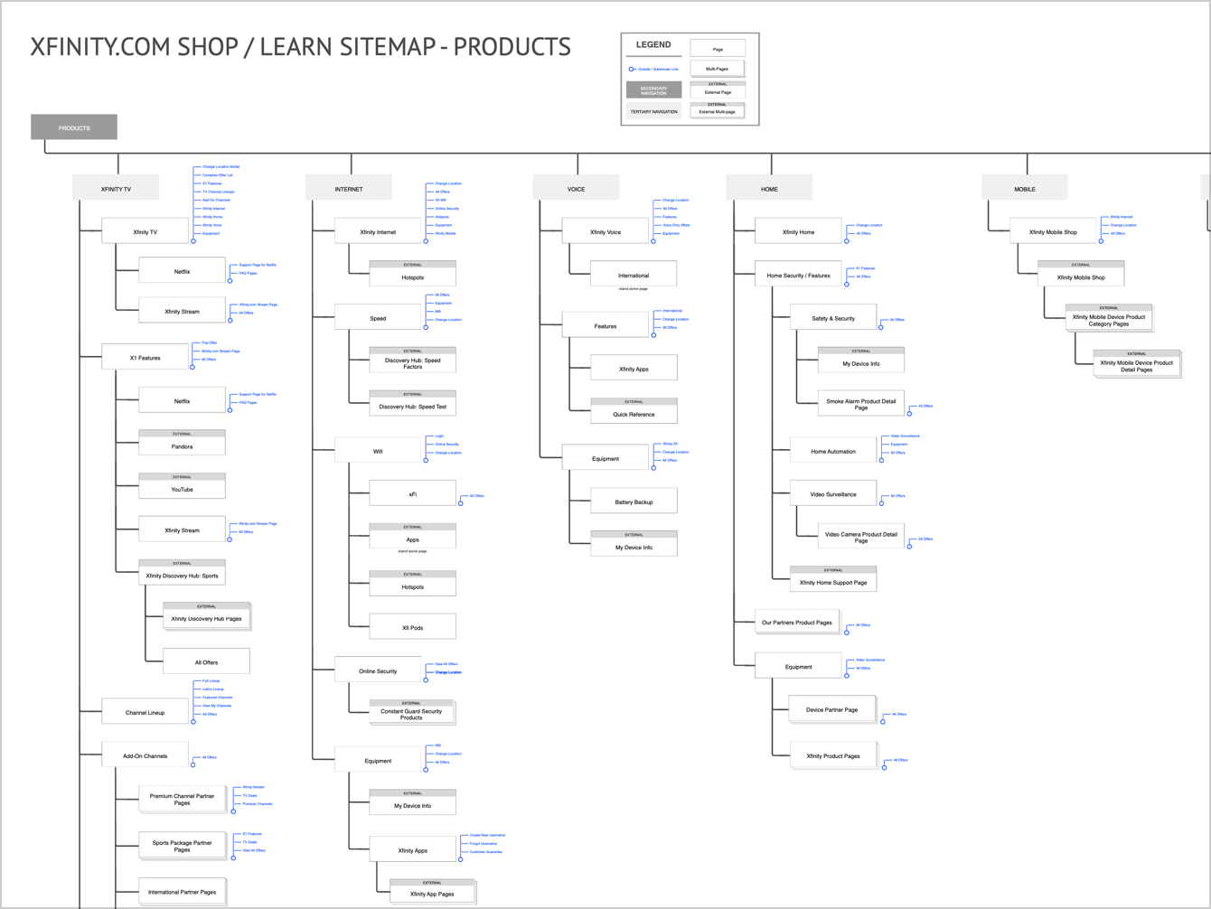
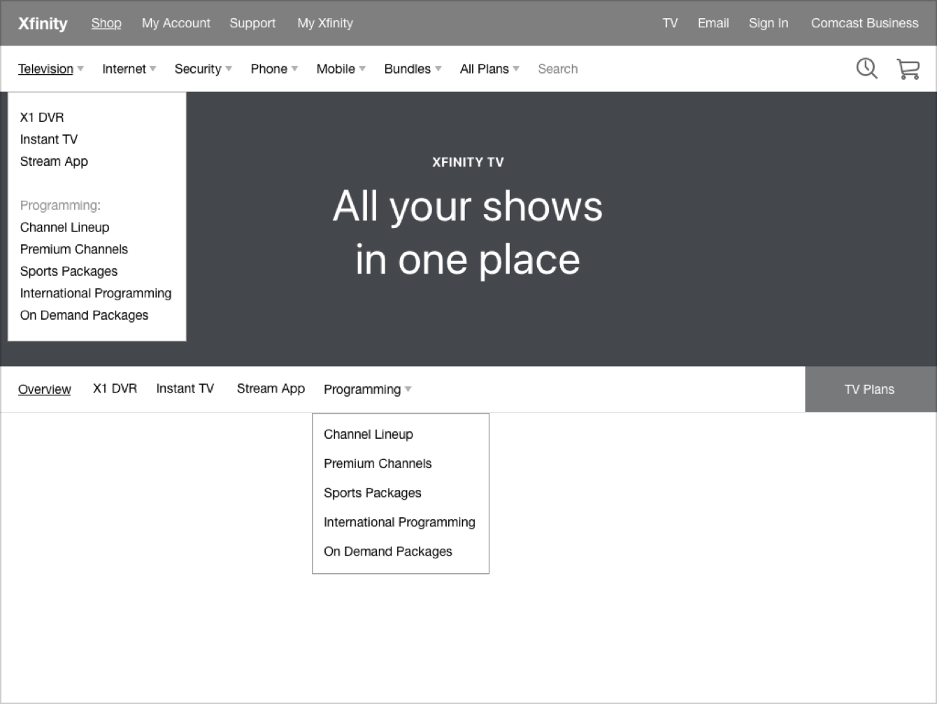
I started the design work by looking at the entire site map. I then thought about how we might want to present customers a high-level set of options. Rather than getting bogged down in extended user testing reviews and card sorting exercises (which had been tried before) I instead took a quick educated guess at what I thought would make sense based off of an efficient competitive analysis. After all, the way that we would be getting user feedback in this case was through actual site performance.
Focusing on the customer
What became clear through this exercise was that the navigation bar is a way for brands to tell customers what it is that they do. For example, Apple uses their navigation bar to list out the different products they sell. What Xfinity had been doing at the time was listing different categories of content. This included things like products, help and support, and offers, etc. This approach didn't support what exactly Xfinity was or what they sold. And as a new brand under Comcast, I thought it was important for them to be clear about the types of products they sold and the types of services they offered.
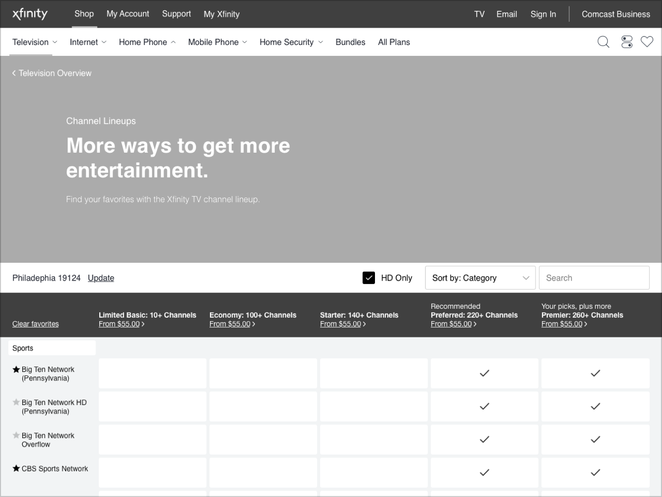
So I proposed that the high-level organizational structure of the navigation bar should be things like television, internet, phone, and offers. And it was within these product categories the customers could see things like the types of products that were offered or links to a support site if that's what they were looking for. I also found that it was likely that customers were trying to find actual plans that they could sign up for under the previous “products” drop down. So in the new design I proposed having a link to view plans for a particular product category within that drop-down.
Delivering designs and results
Through our process of wireframing and prototyping I was able to share the new approach with key stakeholders and leaders at Xfinity. They were able to quickly understand the value that the new design would have for the business and appreciated that this update was compartmentalized from other parts of the Xfinity ecosystem. They introduced the new design on the live website, and saw and increase in users navigating around the site, spending more time to understand Xfinity's offerings, and ultimately purchasing more than they had previously.