Bringing Safari Up to Speed
The Importance of Safari
Safari is technically a platform on it's own, separate from the App Store. Until the day that Gatekeeper comes to iOS, it will continue to be the most open way for users to access information on Apple's mobile devices. But besides iCloud Tabs and Reading List, Mobile Safari has remained basically unchanged since it's unveiling, in 2007.
I wanted to conceptualize what Safari on iOS could be if it took on the developments that have occurred on other browsers over the last few years, and adjust the user experience to match changes that have occurred elsewhere on the platform.
Unifying the Address and Search Bars
Today, all modern browsers have a unified address and search bar (including Safari on the Mac). What Apple calls a "Smart Search Field" has also expanded beyond the typical search and go, as it looks through your history, previous searches, and sometimes even the content of pages that you've visited. Unifying the two fields also has the potential to speed up the browsing experience; you can't accidentally tap on the wrong bar. I remember when I first started to use a unified bar on Google Chrome, the experience just felt infinitely more simple and straightforward.
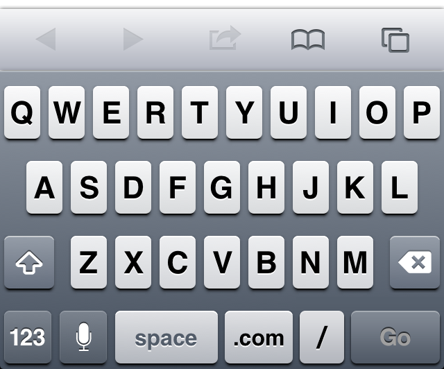
One of the obstacles to this unification is the unique keyboards that appear when the user taps on one of the two fields The search keyboard is pretty typical, while the address field's keyboard is built to type URLs. I had to dilute the individuality of the boards in order to make them come together. But, in the end, I think there is a net gain to the average user.
You'll notice that the bottom bar is on top of the keyboard, which might look a little strange at first. What it does, though, is it allows for the user to immediately begin typing on a new page just as easily as they can access their bookmarks. This would, again, save the user a from an unnecessary tap.
I've added icons to the results to help the user understand what each option is. If you start to scroll the list, the keyboard goes down and out of the way, like it does in most other apps.
Better Bookmarks
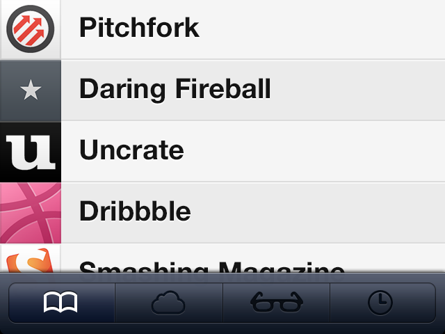
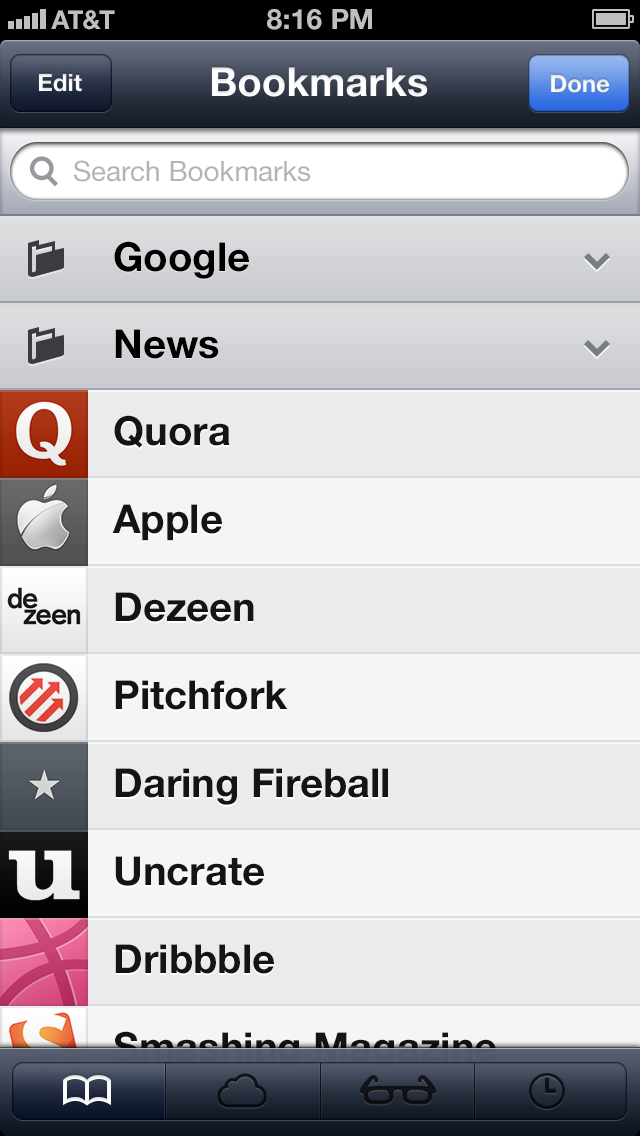
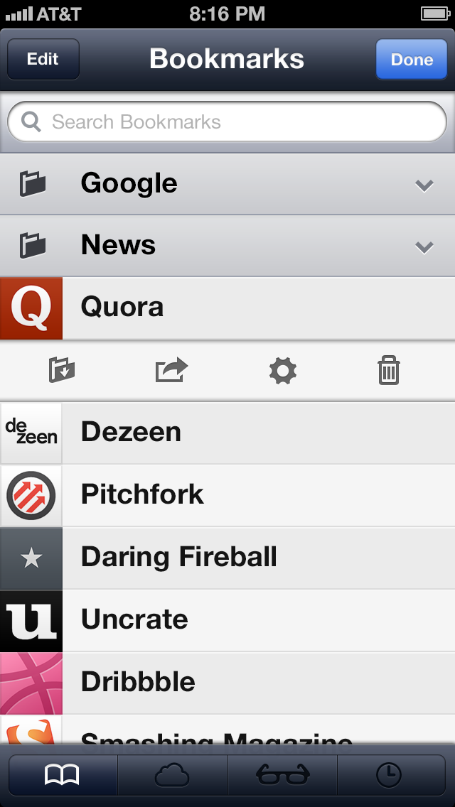
Currently, when you tap the bookmarks button, you are greeted by a series of bookmarks, folders, and pseudo folders for Reading List, iCloud Tabs, and History. While it makes sense for Reading List and History to be in this section of the app, iCloud Tabs really belong under the Pages hierarchy (more on that later). Personally, I don't think that pseudo folders make sense, so I instead made them tabs across the bottom of the screen. The designers of iPad's version of Safari seem to agree with me.
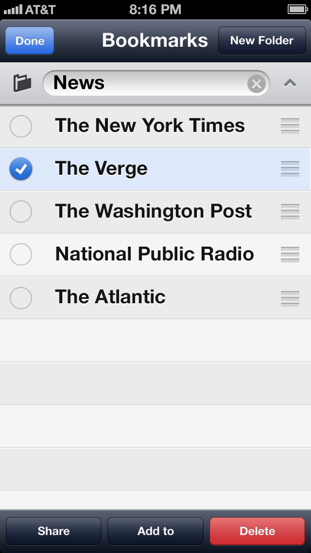
So now we're going to get into some deep UI stuff. On the iPhone, there's a need for a "Done" button because the bookmarks section fills the entire screen; on the iPad you just have to tap anywhere on the screen to dismiss the pop-up, and when you're inside of a folder and you press "Edit," the back button is replaced with a "New Folder" button (which I thought was less than elegant). In the end, it was the back button on the top of the screen that I needed to do away with. But in order to do that I had to completely change the way that folders look and feel. I took some lessons from folders on the home screen (which don't have back buttons).
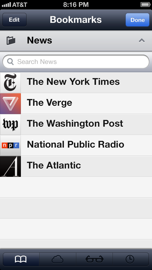
In my version of Safari, folders are behind the list. When the folder in the list is tapped, the list breaks in half and slides out of the way to reveal the contents of the folder. Tapping on the title of the folder a second time closes the folder.
Like all other apps, search would be hidden under the title bar, and you would have to pull the list down to reveal it. I'm just showing it here because it doesn't exist in the current app.
Editing Bookmarks
Editing bookmarks could be much more efficient by using the batch editing system that exists in the stock mail app. That, combined with bookmark options appearing when the user swipes over a bookmark (think Twitter), makes for a much more robust editing experience.
Bookmark Stream
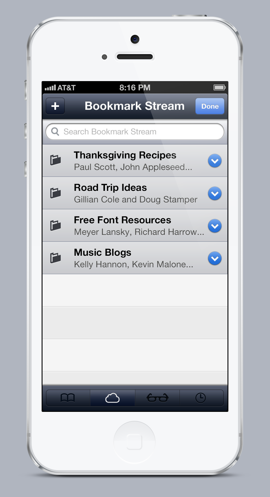
After a few months of using iOS 6's Photo Stream feature, I found it disappointing that Apple didn't pread the iCloud love to its other apps. Really, every stock app on iOS could have better integration with iCloud, beyond simple syncing. There could be collaborative notes, you could send people reminders, or you could have public bookmark folders just like you have public photo albums through Photo Stream. So while Bookmark Stream might not be the catchiest name, I think that it's an idea worth exploring.
Unlike Photo Stream, Bookmark Stream would be collaborative; more than one person could contribute to the contents of a folder. The user could also choose to simply share the contents of a folder. In order for this system to work, the participants of the stream have to be divided into two categories: "contributors," and "subscribers." Contributors can view and edit the contents of a stream. Subscribers can only view the contents of a Bookmark Stream. If it isn't public, contributors could also invite people to contribute or subscribe to the stream (if it is public, then anyone with a subscription link could subscribe, but they would still have to be invited if they wanted to contribute to the stream).
Once more than one person is a contributor, the stream cannot be deleted unless all contributors have "left" the stream (Tumblr does something similar with their blogs). If you want to get an idea of what editing a bookmark stream would be like, click here.
Notifications can be received when new bookmarks have been added.
Reading List
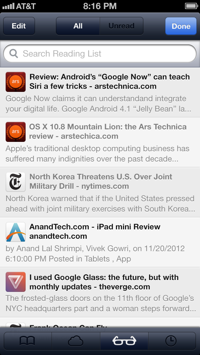
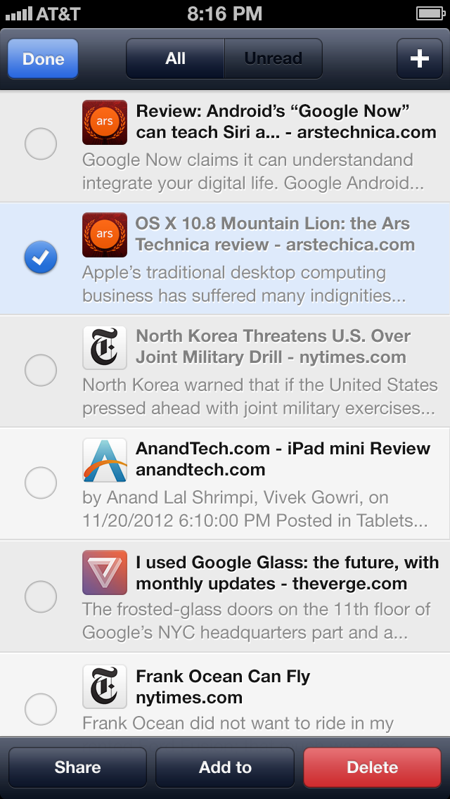
Reading List is essentially left unchanged. I've moved the UI around to save space, and I've added the ability to batch edit. When in the editing mode, a "+" button replaces the "Done" button, which allows the user to add an item to their reading list.
Pages
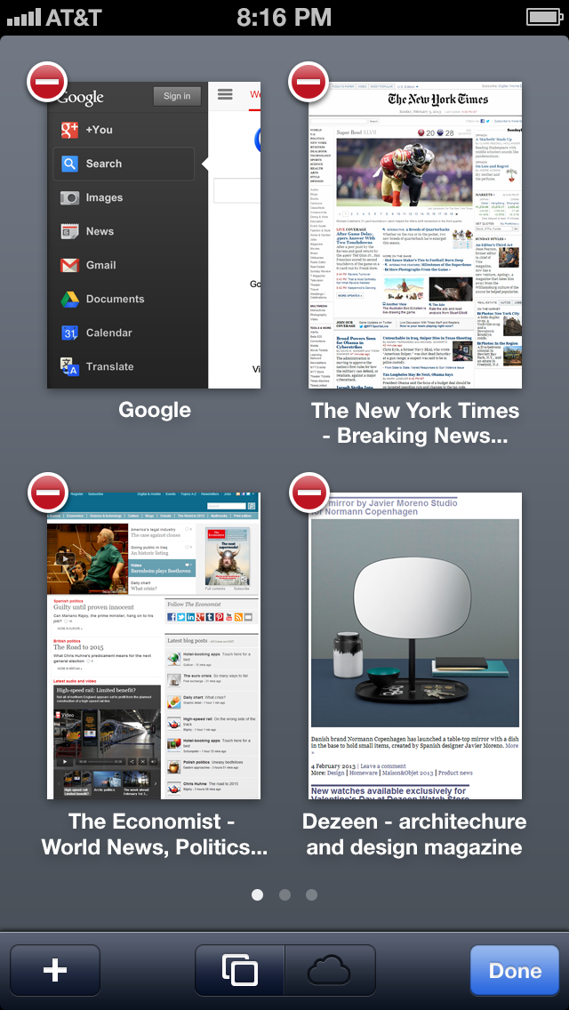
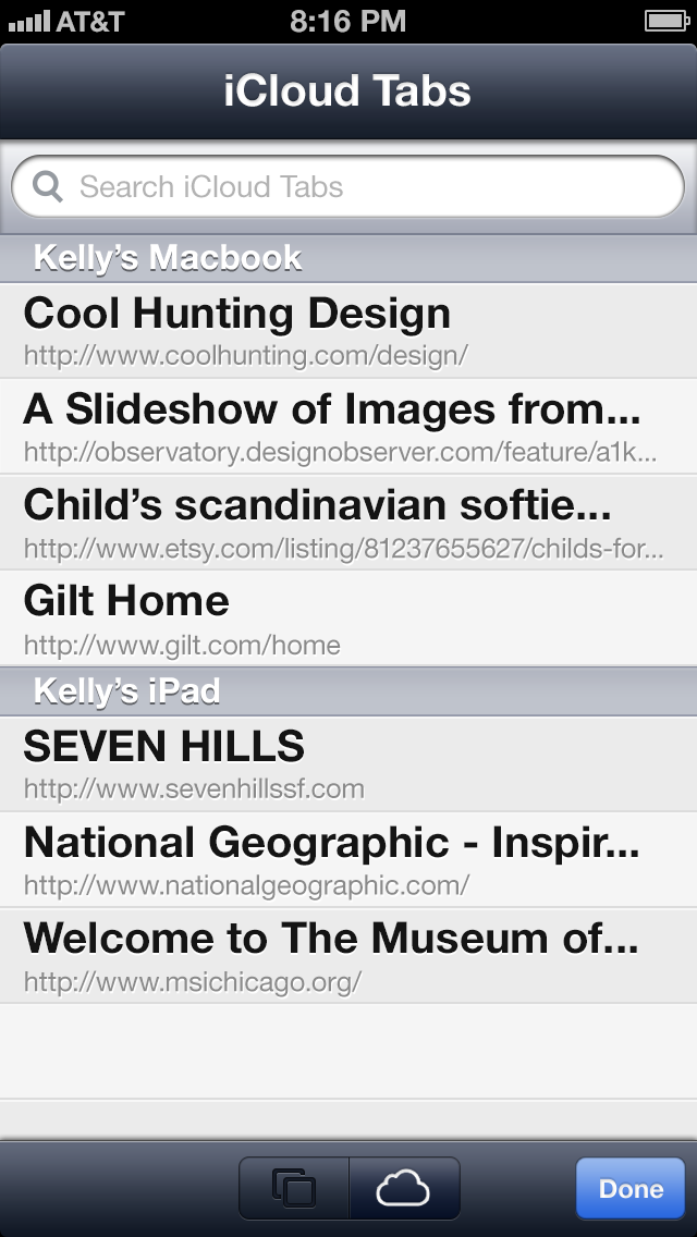
The pages view has changed quite a bit. Instead of simply showing one page at a time, the user can see four. As I said before, iCloud Tabs moved from the bookmarks section to the pages view.
Connecting Apps to Web Content
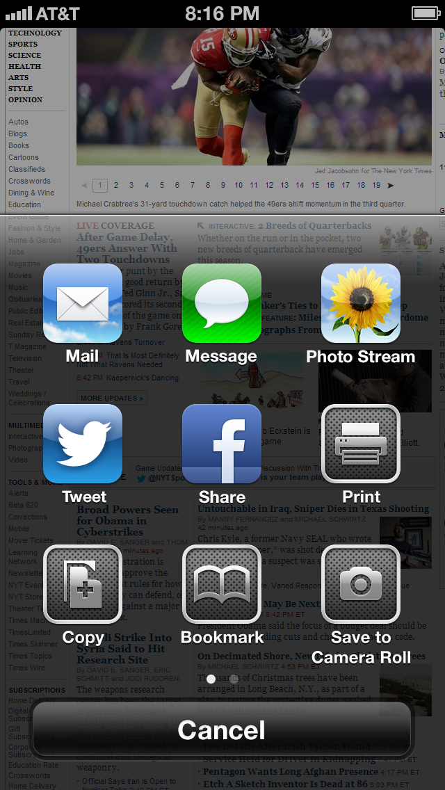
In iOS, an app can tell the operating system that it has the ability to handle certain file types, and an app can have support for its files to be opened in other apps. But what about web content in Safari? I think that apps should be able to access content on the web through Safari's action sheet. Here's a few types of content that apps could handle:
- Links (whether it's a link on a page or the page itself)
- Articles (using Safari's ability to grab articles from the web)
- Webpages (Actual code of the webpage)
- PDF files
- Images
- Audio
- RSS Subscription Links
- Podcast Subscription Links
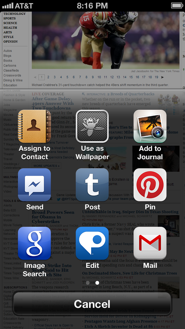
As is currently the case, the action sheet is called by either pressing the action button (for acting on the entire page) or long pressing on the content that you want to take action on (for acting on something within the page). Here's an example of what might happen when an image is long pressed:
Of course the list is only limited by the types of apps that you have installed on your iOS device. If you have Photoshop Touch installed, then you could open .psd files.
But apps should be able to do more than just open files, there should be a potential for apps to be able to commit different actions to content. So you could Tweet a link or you could DM a link, through Twitter. Two actions, one app.
The user would have control over which actions would appear in the action sheet, in the settings of Safari. The actions could be rearranged within the sheet by holding down one of the icons until they wiggle, the same way that icons are rearranged on the homescreen.
Of course, this kind of "open action sheet" would be great to have on the system level, but because this is only a concept for Safari, I will have to leave it there.
Web Notifications
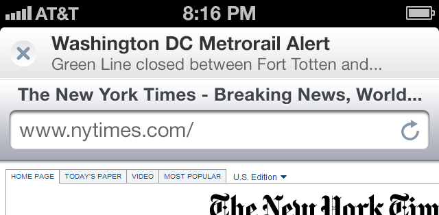
One of the newest developments in web technologies is web notifications. Most modern browsers have support for web notifications, and I think mobile Safari should support it too. Controlling which websites can send you notifications could be handled in notification setting in the same way that Mail's notification's are handled (on an account level). So each website could have its own alert style and sound, and the user could choose whether they want the notification to be visible in the lock screen and if it would create a badge on Safari's icon.
When you get a notification and open up Safari, a little banner with the notification text would be pinned to the top of the app. You could either dismiss the banner by tapping the "x" or open the notification's web page by tapping the banner.
Reader
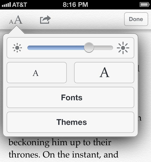
Reader on Safari is basically a stripped down version of iBooks. But why does it need to be stripped down? I think that people are just as likely to spend half an hour reading a long article on a rainy Sunday afternoon as they are to read an iBook. Reader on Safari should have support for quote sharing, pagination, user designated themes, user designated fonts, distraction-less reading, and independent brightness control.
Safari is just one of Apple's many stock apps which I think are in need of an update. And while the updates that I'm suggesting might not be perfect, I think they would keep iOS moving forward.
Some of the features that I'm proposing, like Bookmark Stream, could be on all versions of Safari. I wanted to limit myself to the iPhone's version of Safari, so that the project wouldn't get too out of hand. I'll save the iPad and Mac's version of Safari for another day.
Thanks for reading.
Resources

